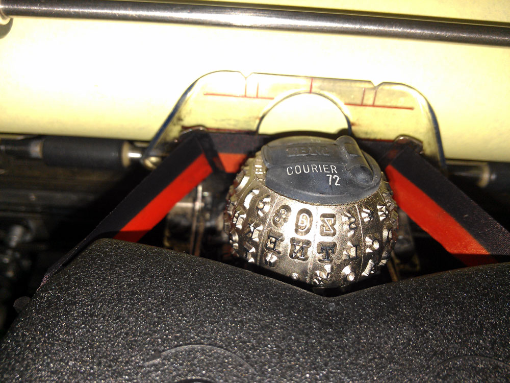
The “ribbon position selector on a model 72 isn’t super-easy to get at and switch on the run, but it does work.
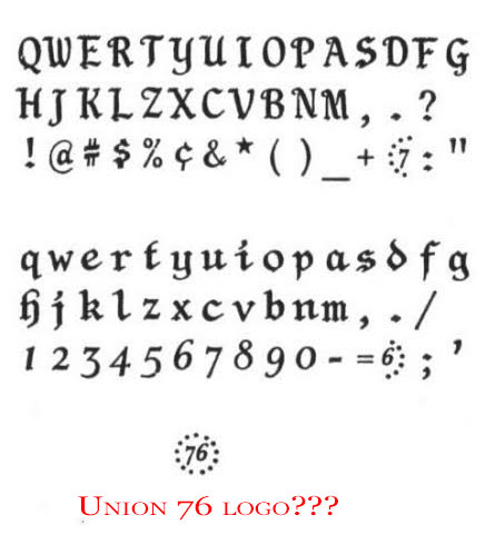
“The element is solid black with no markings on it other than what looks like the manufacturer logo – ELEMENTE
The lever design is unique and works smoothly compared to an IBM design. There is no name of the font or the pitch. The element is black plastic, but it looks very dark green under the light.”
While my original impression was that the two fractional characters when typed together (similar to the smiley face on GP “Sunshine Script” elements) made a logo that looked like the Union 76 oil company logo, the Professor remarked that it looks more like a logo that was commonly used during the USA Bicentennial celebrations of 1976, and I agree. Perhaps this strange element was a special run for the ’76 celebrations, to capitalize on American fervor for colonial-style stuff during that year or so? The typeface’s lowercase does look very German Fraktur-like, while the uppercase seems more English-language calligraphic in style, and more readable than true Fraktur. Anyone have any experience with this typeface/ball care to comment?
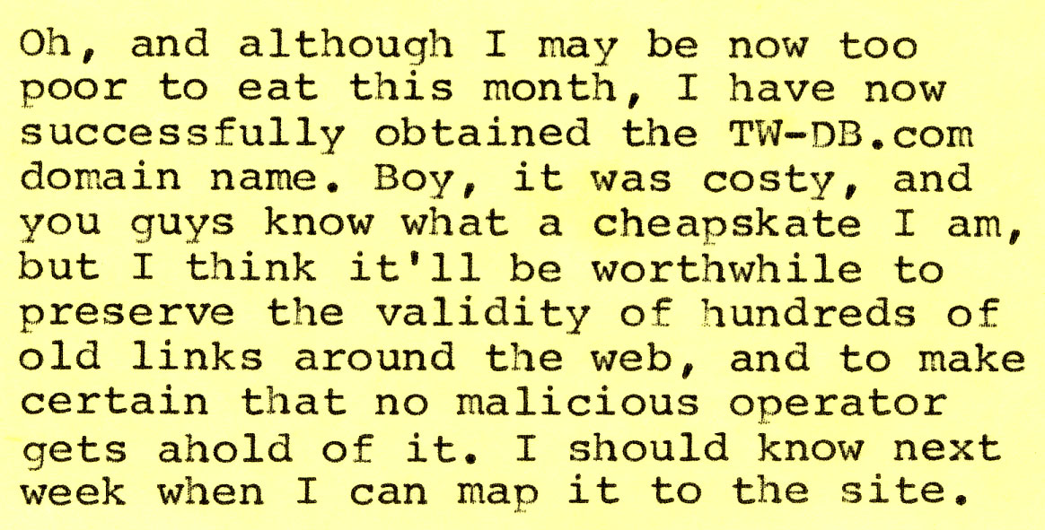 And, in other Typewriter Database news, there is now a page for Xerox – culled from product introduction dates mentioned in a 1987 Xerox Factbook. All you Memorywriter wedge owners now have *something* to go by, which is better than what we had, which was *nothing at all*. :D
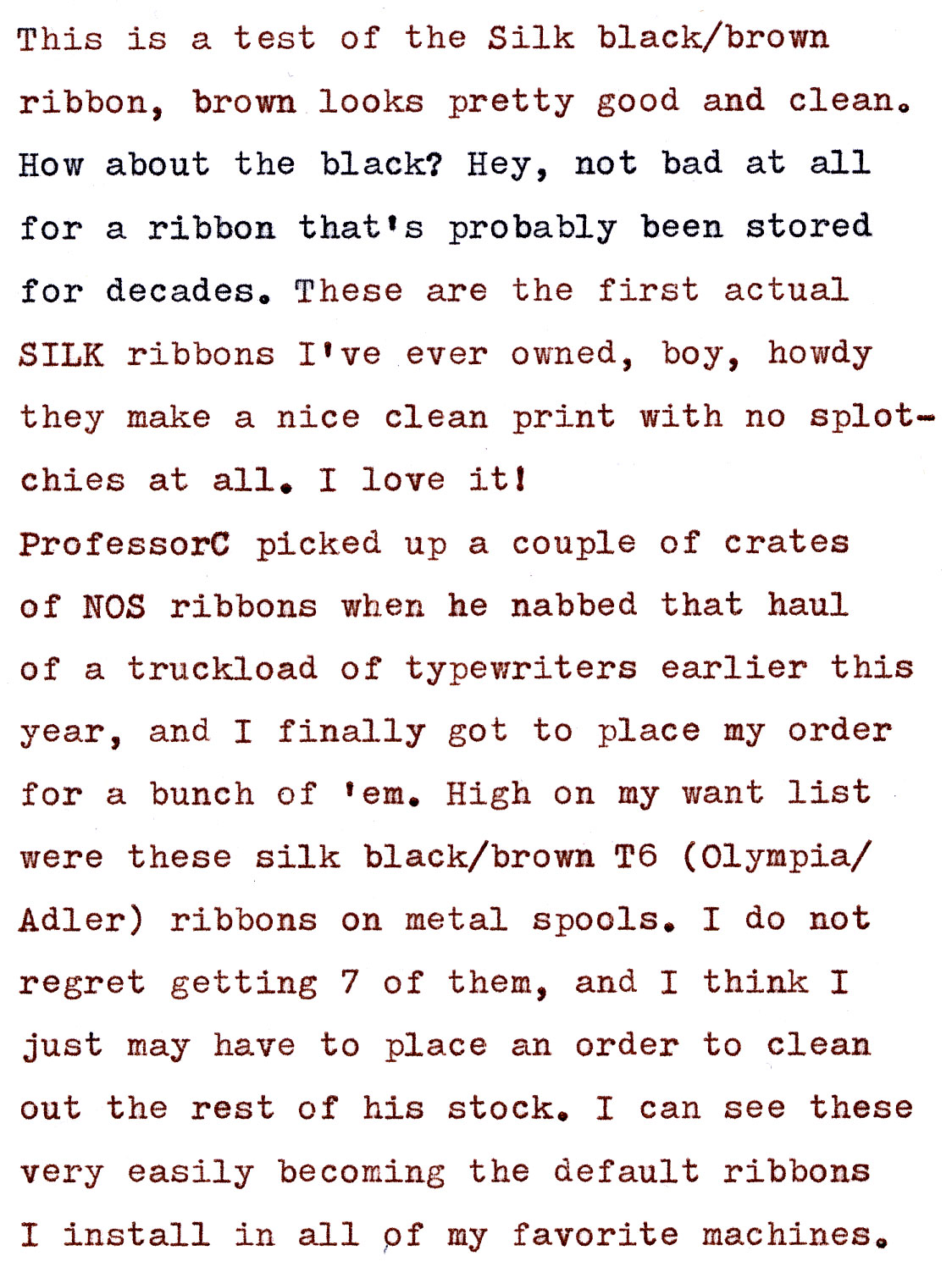
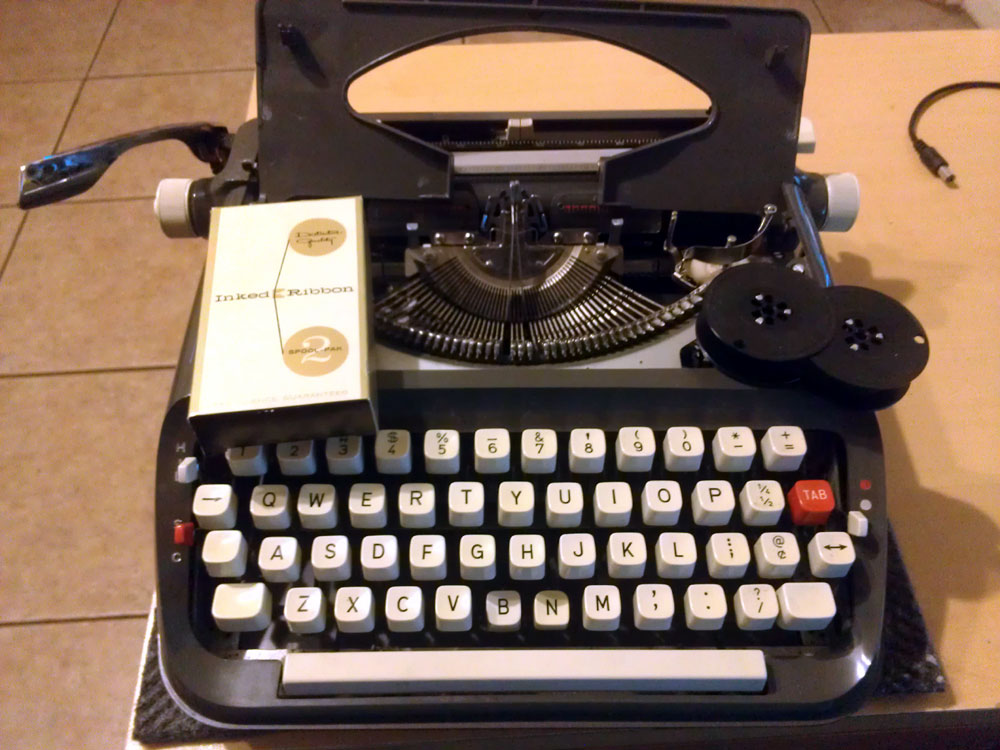

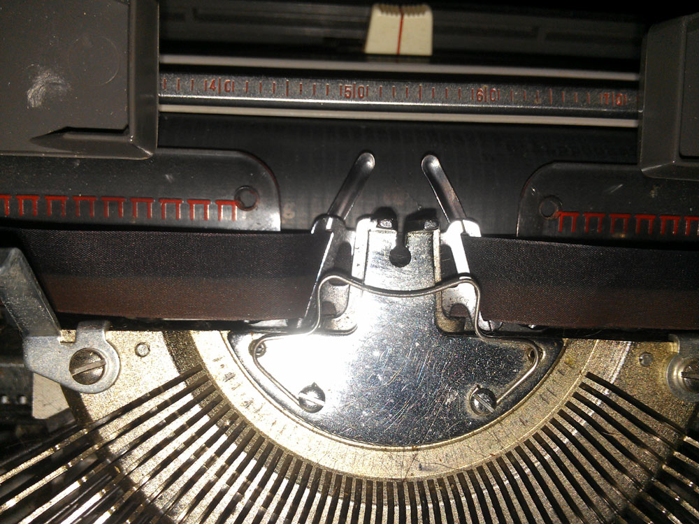
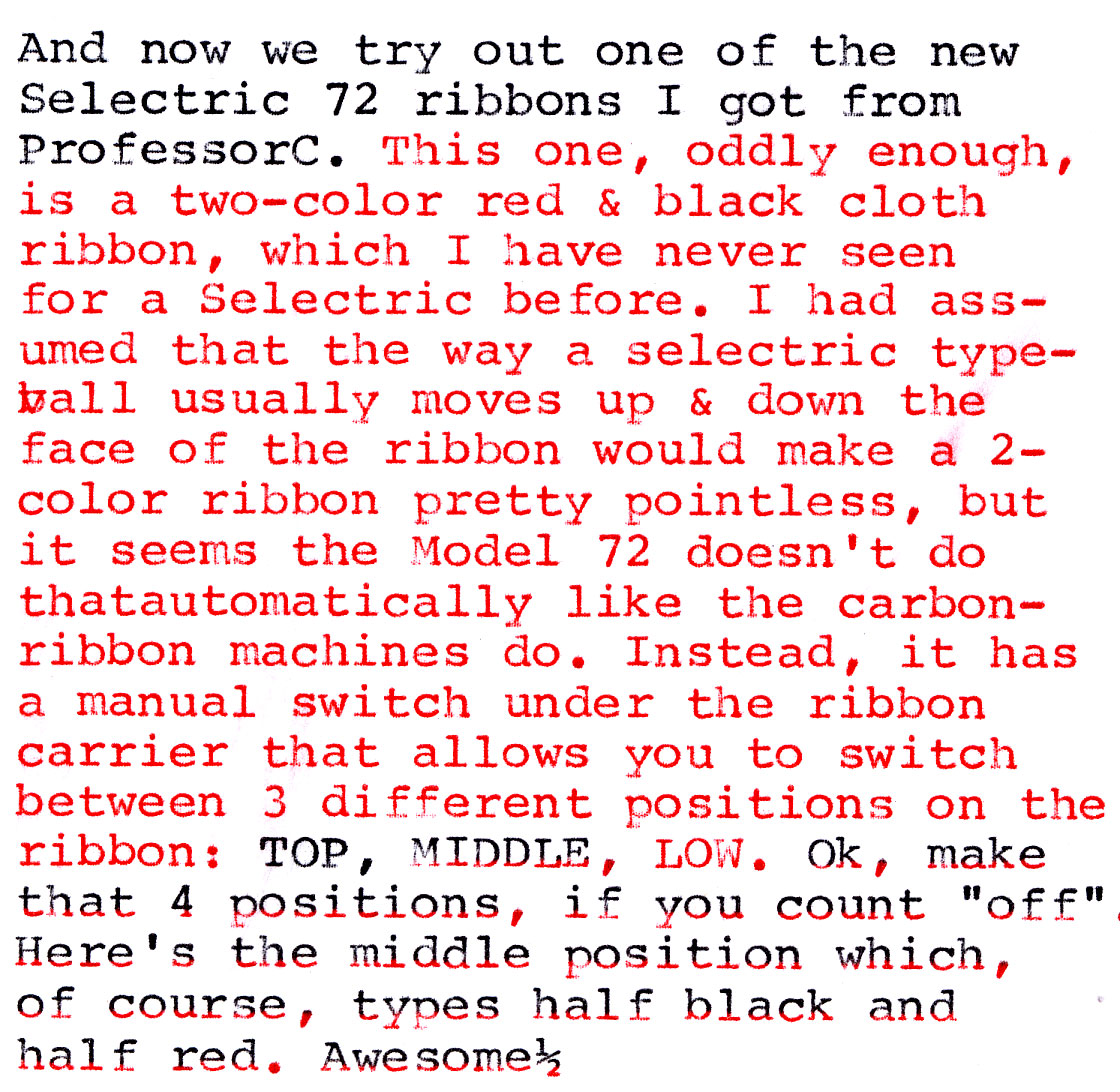
Congratulations on getting the domain name!
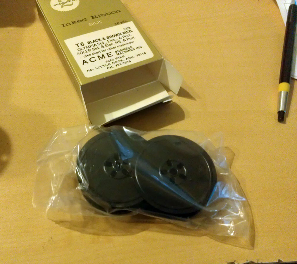
That is some unique information on the ribbons. I bought some old unused silk ribbons and they work fantastic. I’ve yet to buy a new new one.
Your QDL will be tres formidable with those new silk ribbons, Ted. I put an eBay-purchased purple ribbon on mine and it is divine. Same with my Silent Super and SM9. I don’t think I’ll ever go back to black now.
I’ve thought of buying some of the film ribbons for the IBM 71 Selectric, but I’ve already got plenty. I’ve heard of people re-spooling them to use on older machines, but the carbon is pretty delicate and easy to flake off. You would have to be very careful to make sure it spooled evenly and without creases.
Glad to know the ribbons are working well for you. Enjoy!
-Clark
Mmmm, ribbon goodness and golfball beauty.
Don’t hesitate to create some sort of retro-crowdsourcing project to have us help with the cost of that domain.
I’ll prolly throw a donation button up on the Database page when I find out what the final cost will be. I’ve paid the auction cost, but I won’t know what else I need to do until the German domain seller actually responds. Likely I’ll need to transfer the domain from their registrar to mine once it’s all settled. Upside: if I have to pay that, the domain will be paid up until 2017, thanks to it’s having been transferred to other holders at least twice already – seems like it’s gone through a couple different owners in the past couple of months.
Silk is cool, I put mine on my Lexikon 80.
Fantastic quality ribbons and spools – and I’ll revisit my Xerox TWDB entry. :)
I’ve got a handful of silk Ribbons, and I’m always amazed at how good they are. They really do make a difference on a good clean typeface. Great score.
I second Richard’s point – get that funding going. I would like to contribute.
Good news on the domain name! And that silk ribbon looks real good. Brown…. very nice!