Well, you know how the Education Department standardized everything in the immediate post WW2 years. I wouldn’t be surprised if the face was designed by committee and the design released in the public domain as a government standardization program for schools.
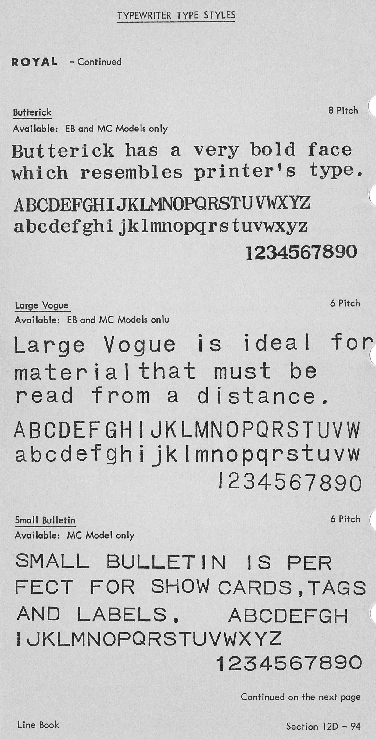
I wonder when royal changed Vogue from a slanted e and a few other letters to straight ones. On old Royals the line on an e is slightly slanted.
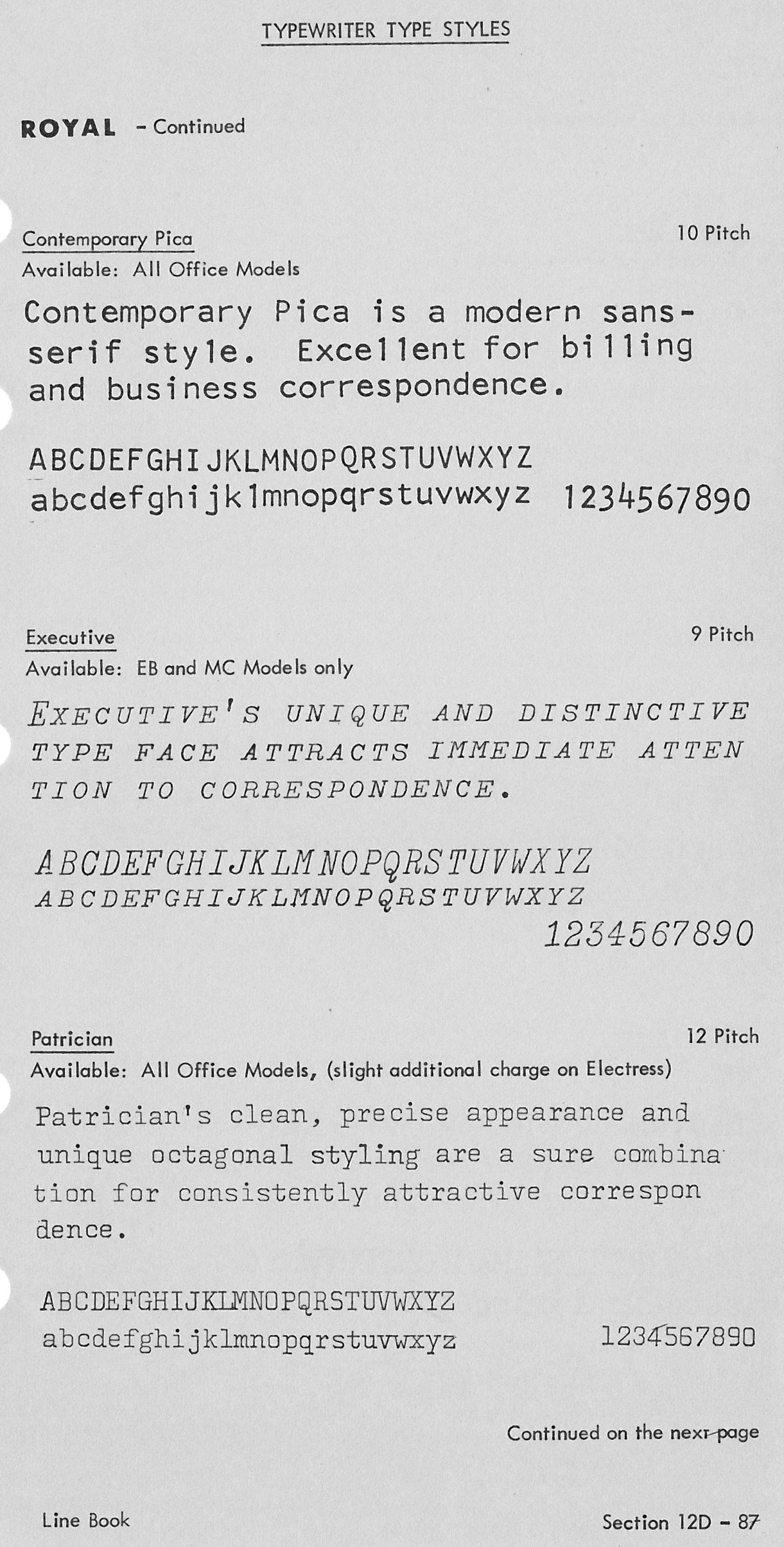
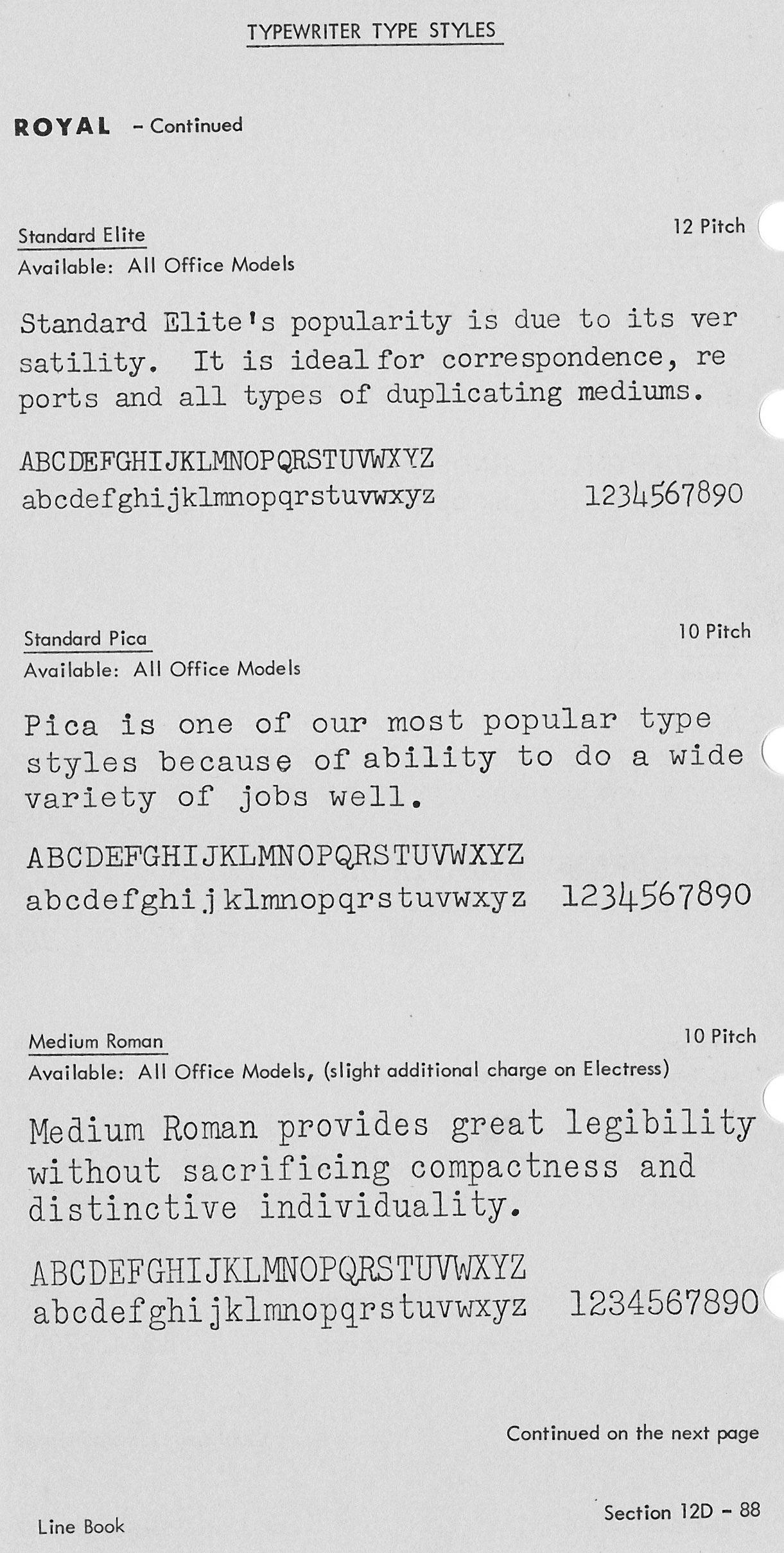
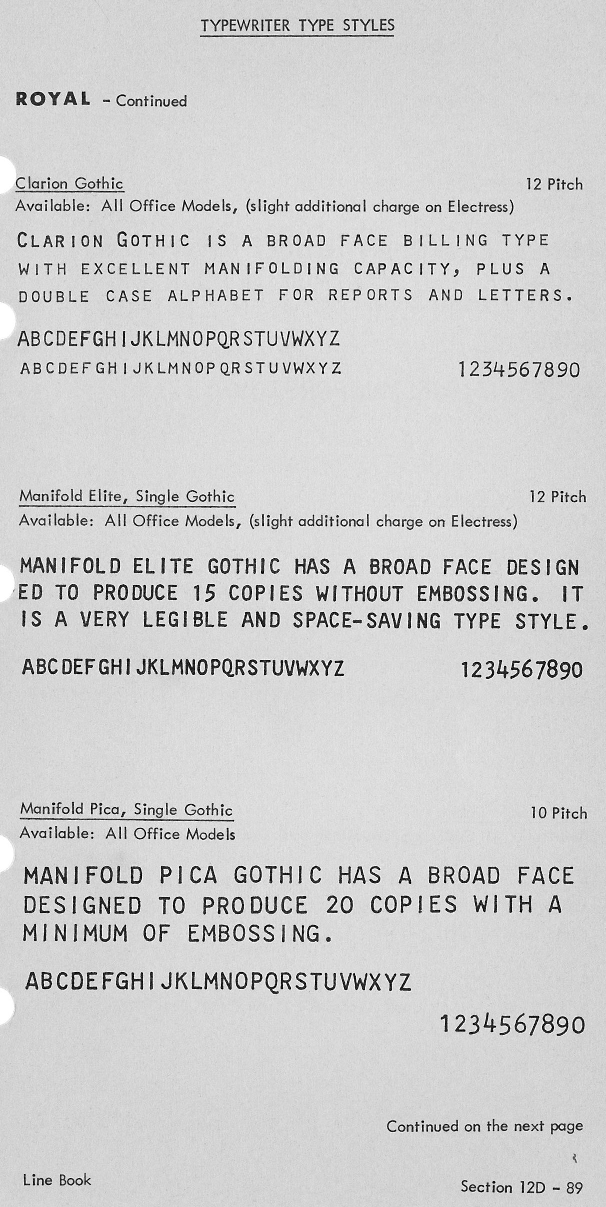
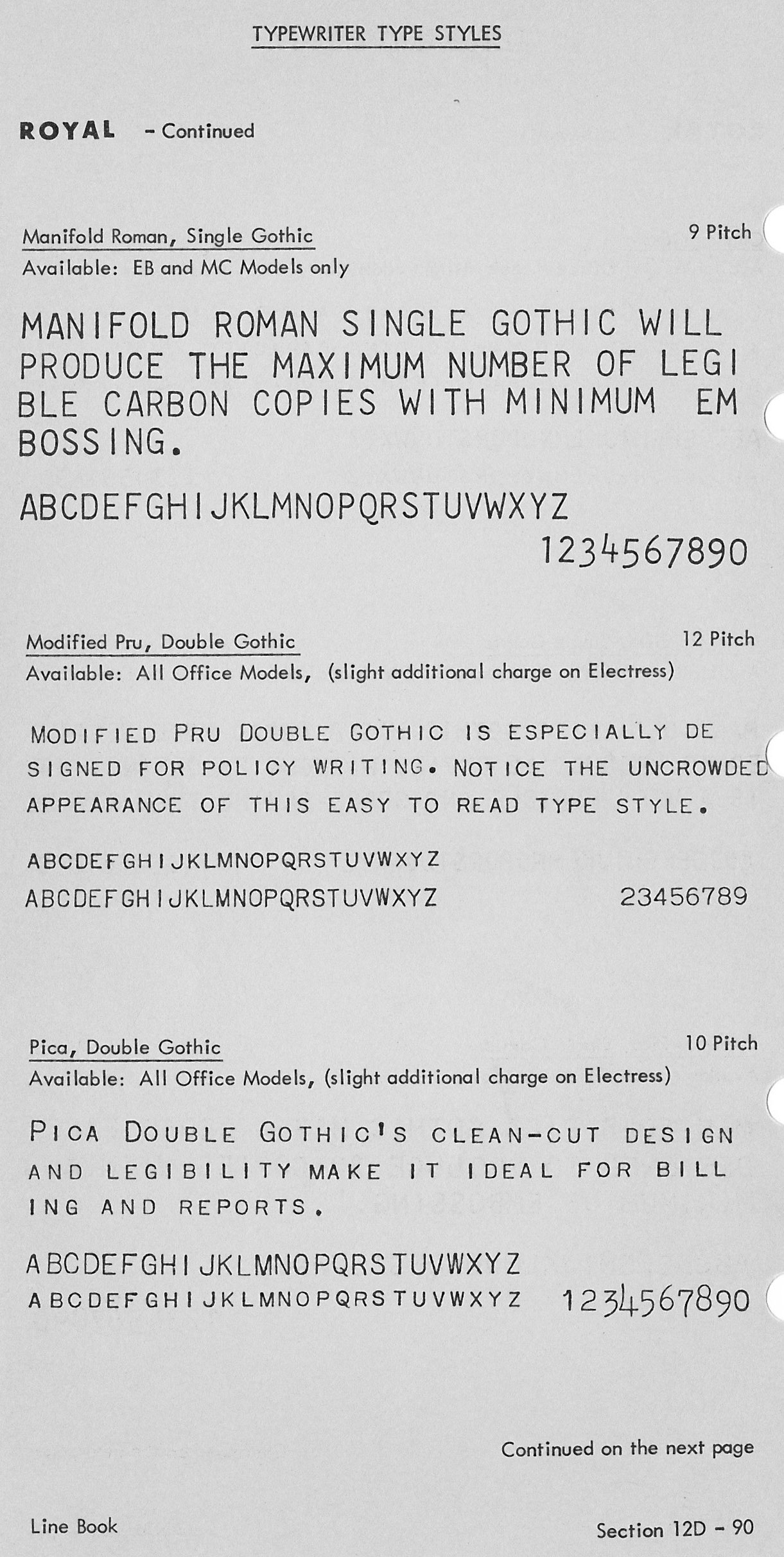
Reference Richard P’s site
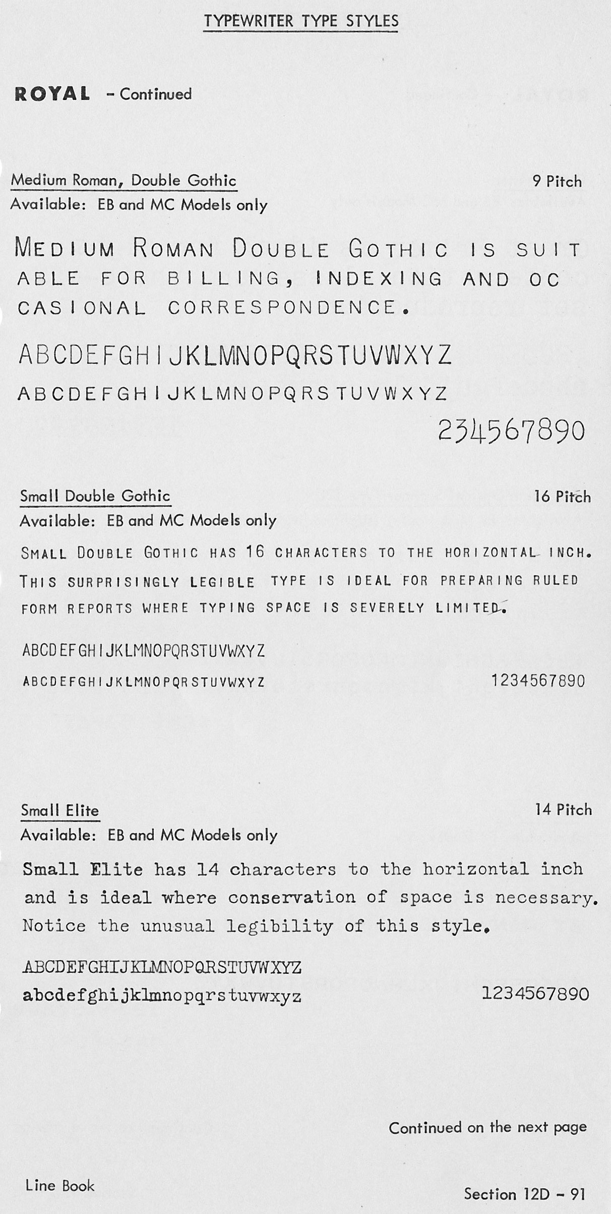
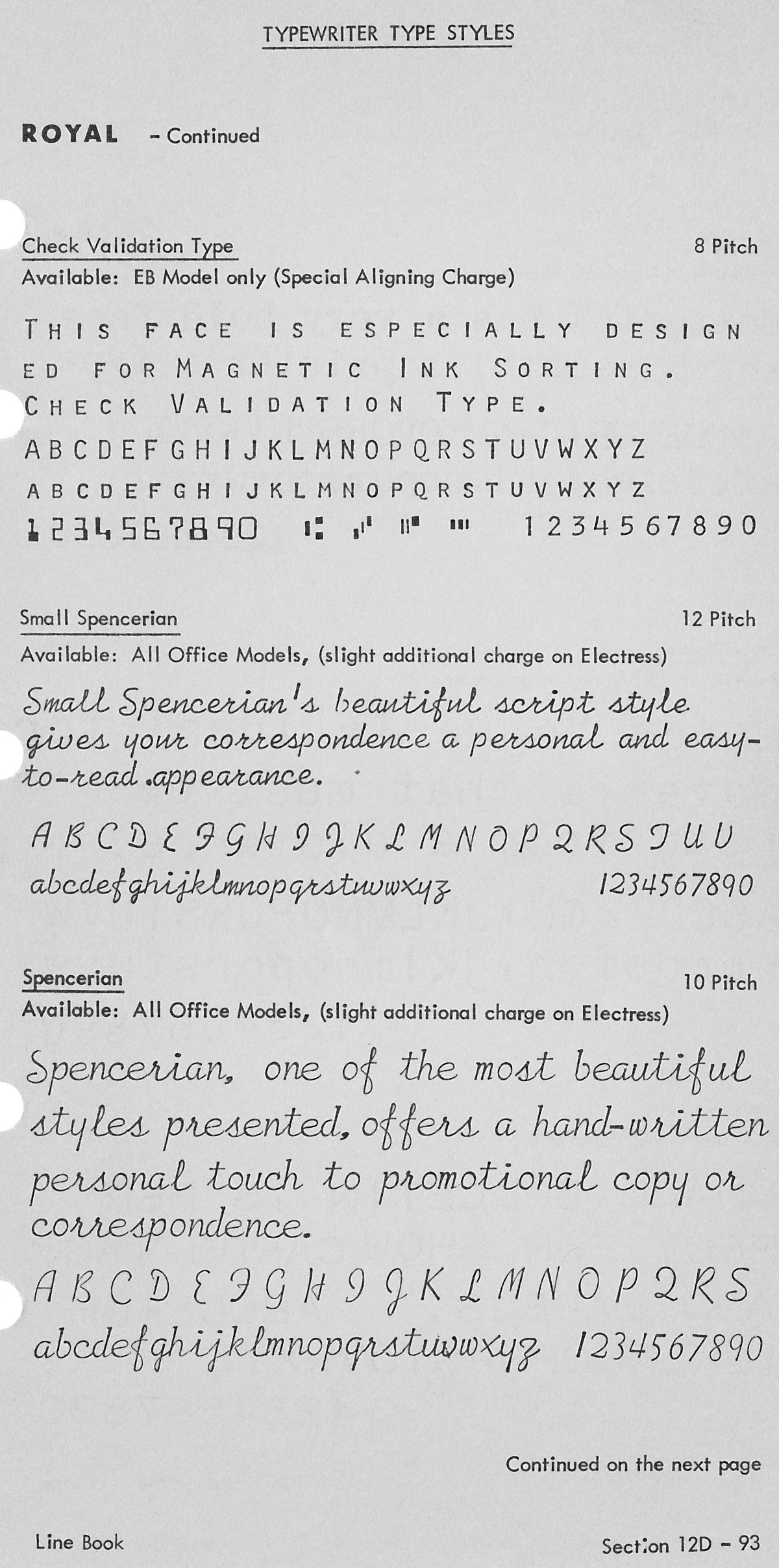
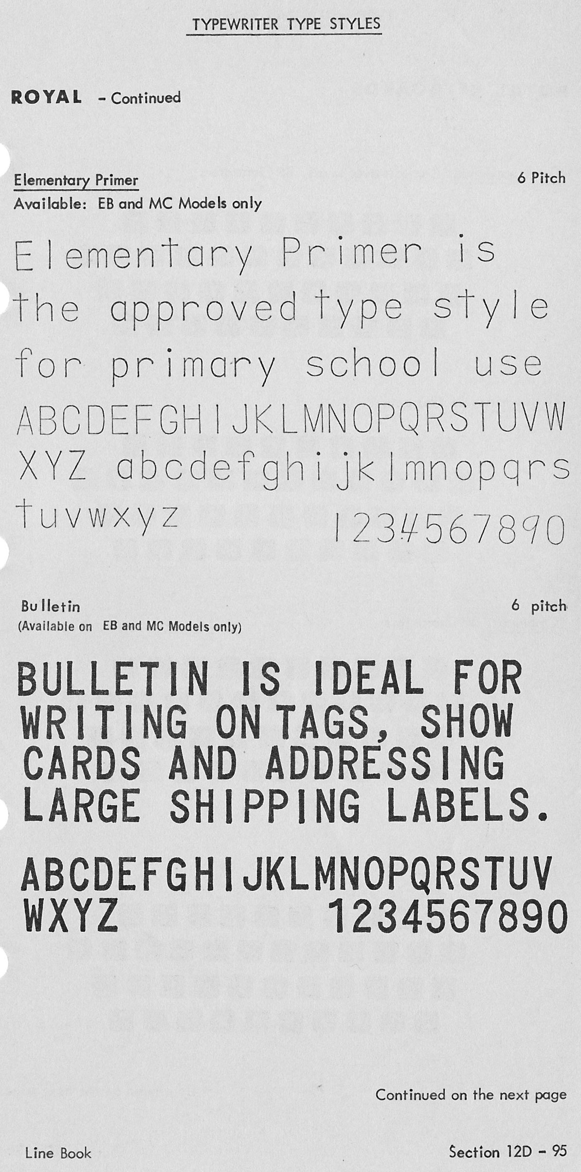
Elementary Primer looks exactly like SCM’s Basic Writing. Oh how I love the Small Spencerian on my Brothers. Type styles sure do get around! :-D
Well, you know how the Education Department standardized everything in the immediate post WW2 years. I wouldn’t be surprised if the face was designed by committee and the design released in the public domain as a government standardization program for schools.
I wonder when royal changed Vogue from a slanted e and a few other letters to straight ones. On old Royals the line on an e is slightly slanted.
Reference Richard P’s site