It is perhaps fitting that I post the last of my typestyle scans on the day that Tom Furrier writes his celebration of the IBM Selectric. I myself refuse to include electric typewriters in my own corral, but if I were to own one, it would be a Selectric. Actually, it would have to be two: a small chromed Selectric 1 with the 11″ platen, and a larger black Selectric III. See? Can you imagine how much table space I’d have to devote to that? It’s clear to me that I cannot fall prey to the siren song of the Selectric because I know where that trail leads.
Tom’s right about the Selectric and the Wheelwriters being the bread and butter for today’s typewriter repairman. On my own visits to MTE, it’s usually a naked Selectric that’s up on Bill’s rotating work table, and there’s usually a half dozen of them sitting in his work queue. I imagine someday soon that guys like Bill and Tom will need to make connections with specialty machine shops to fabricate Selectric parts that they can’t get from suppliers anymore. Selectrics are *that* important to a lot of businesses. Some smart fella with a CNC machine will make a mint fabricating aluminum replacements for certain plastic Selectric parts that tend to age badly, you take my word for it.
And now the typestyle offerings of IBM in 1964:
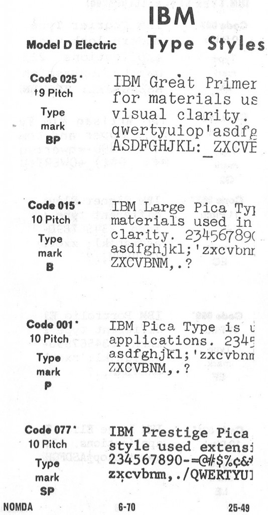
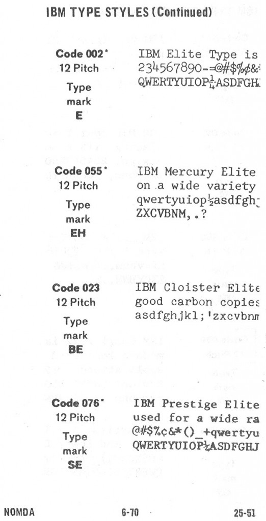
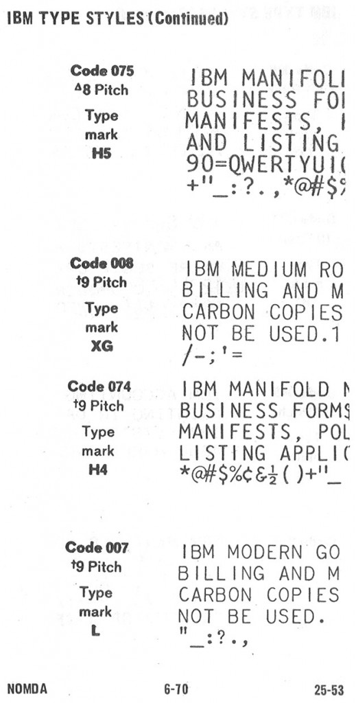
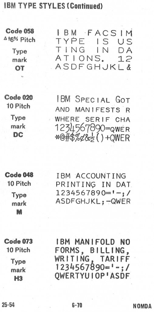
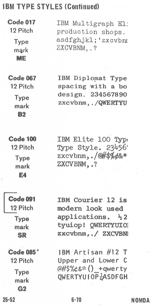
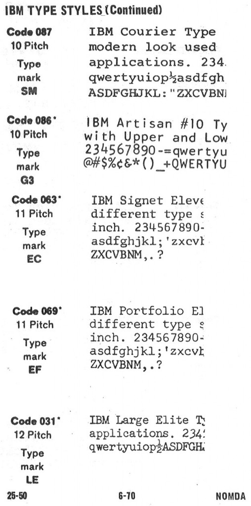
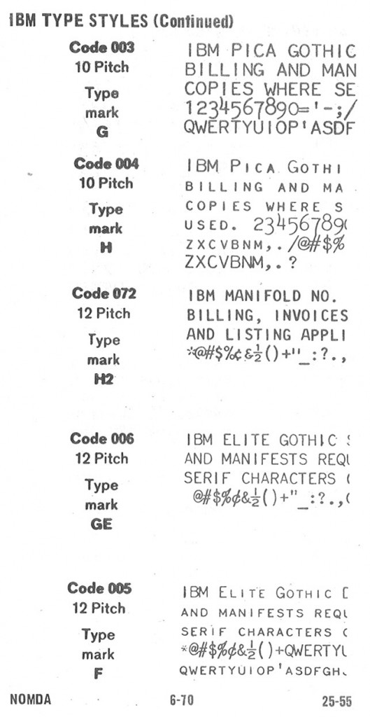
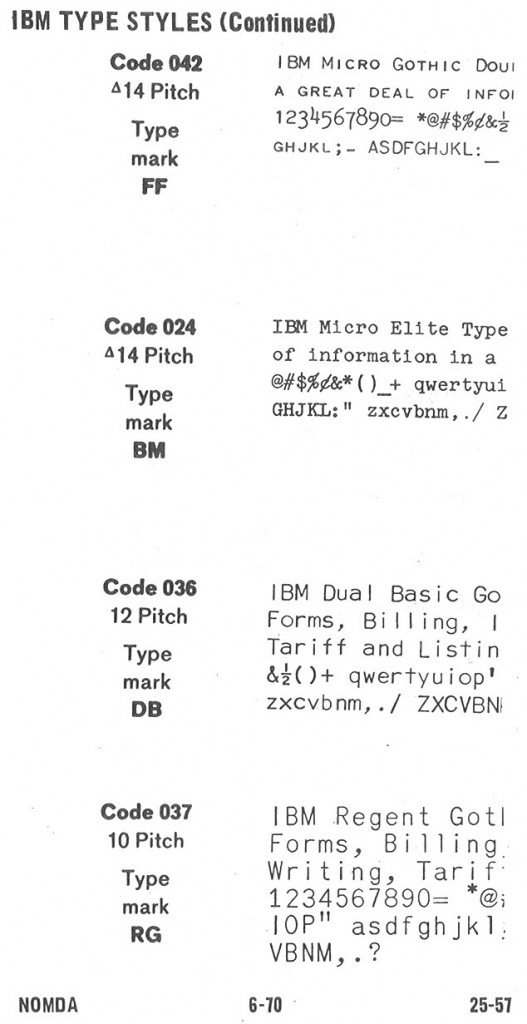
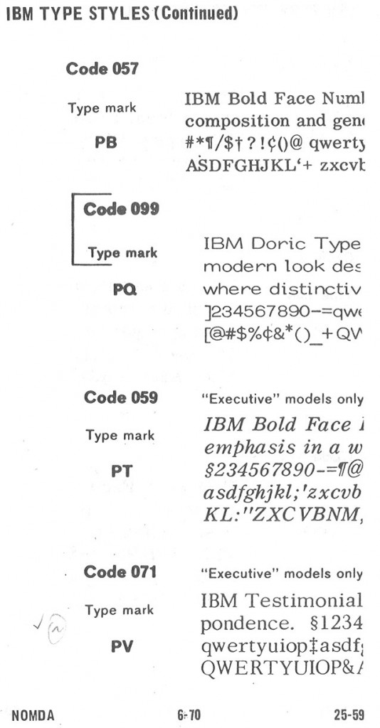
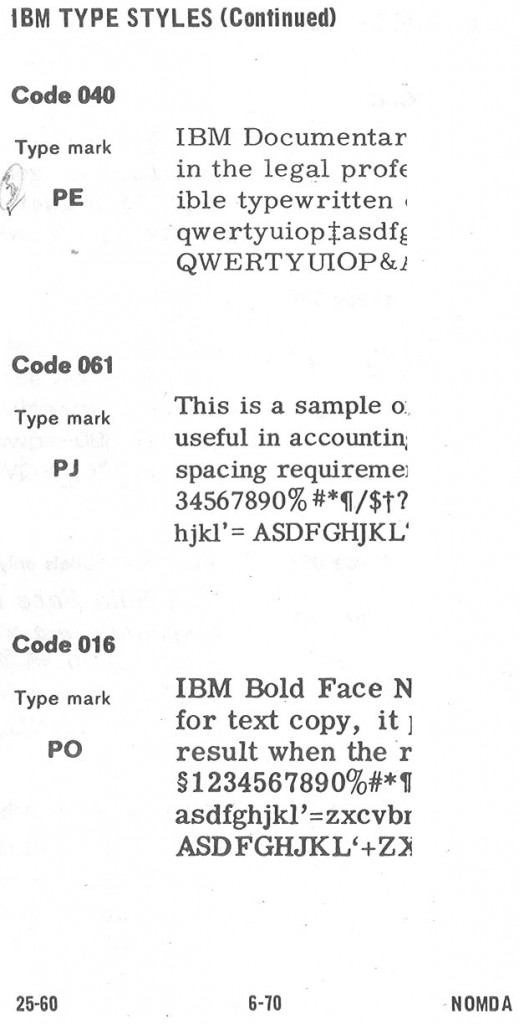
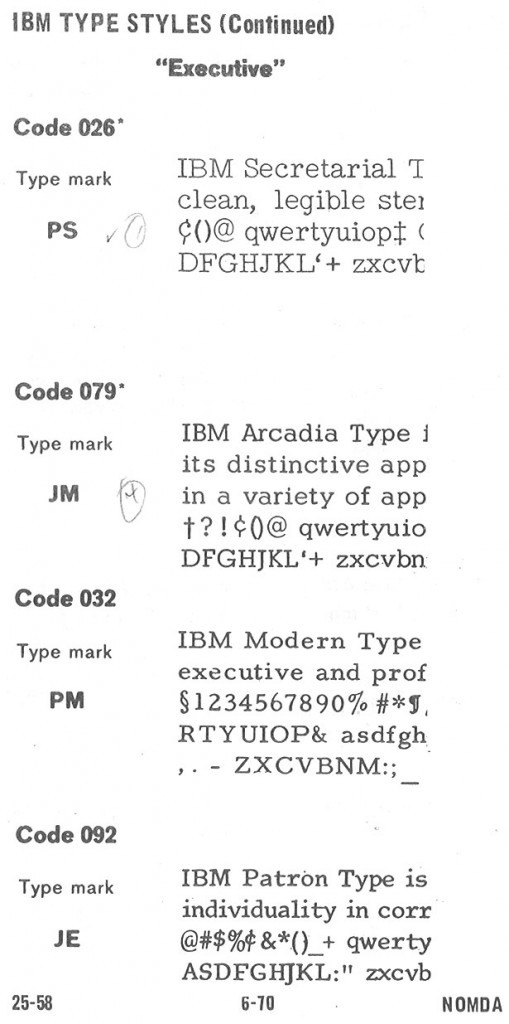
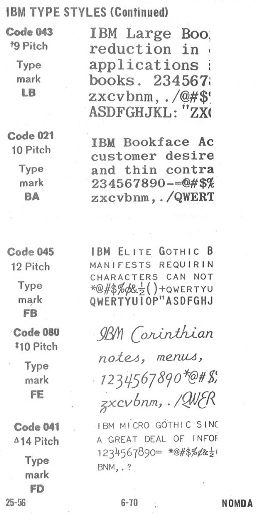
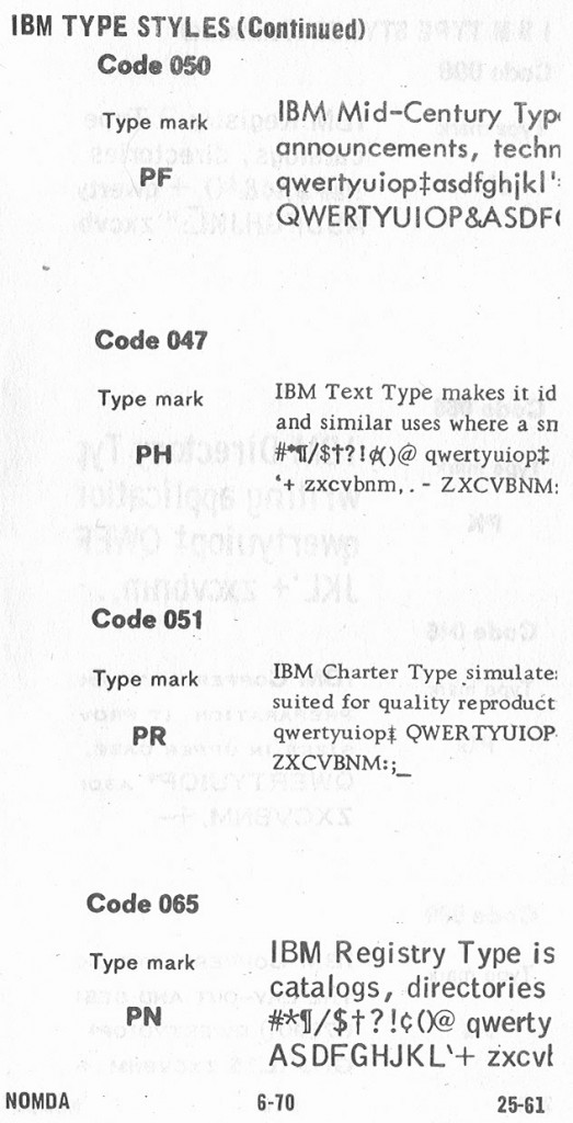
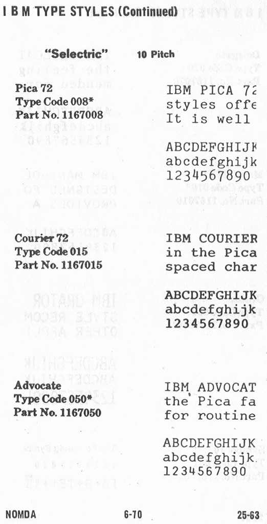
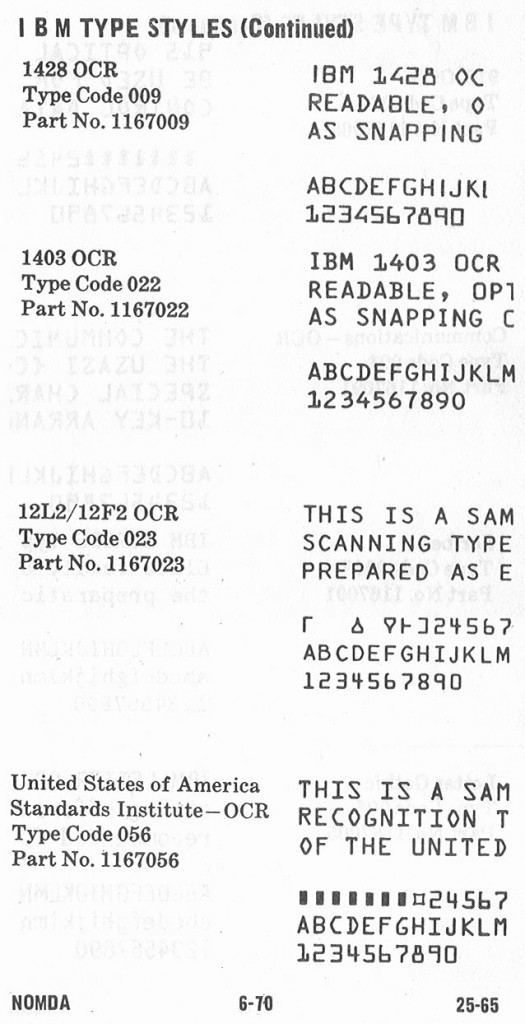
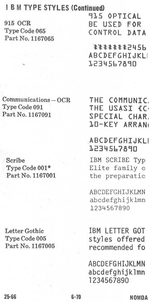
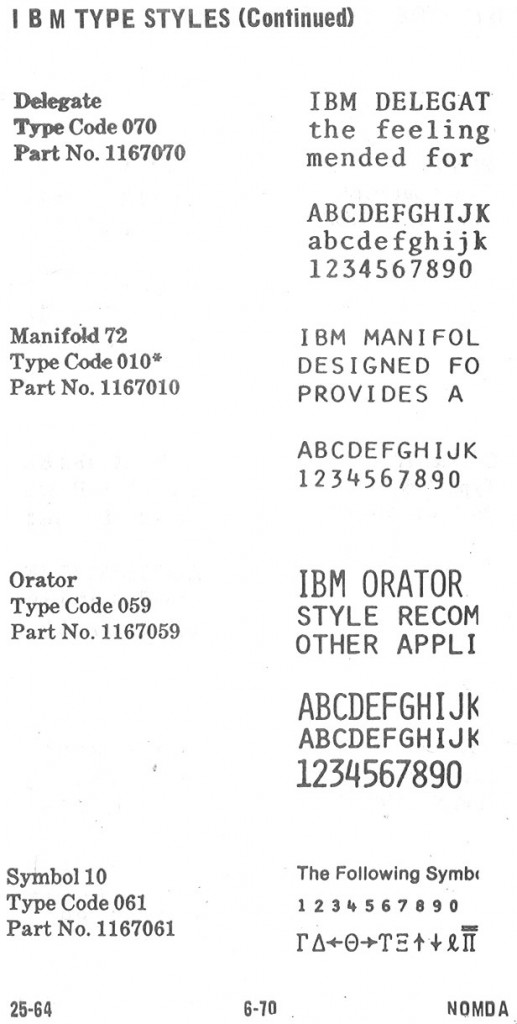
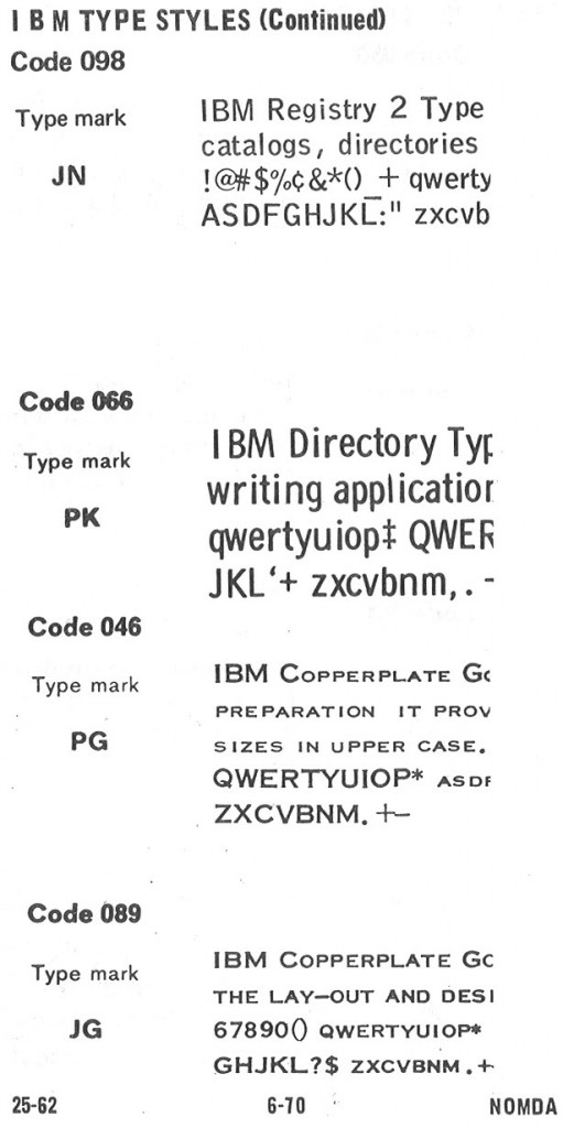
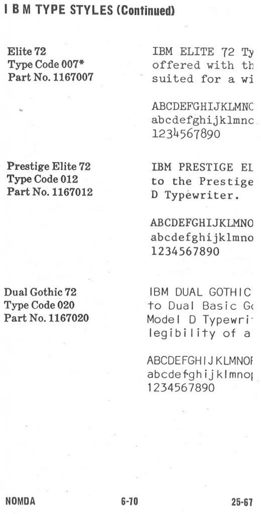
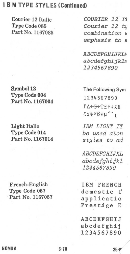
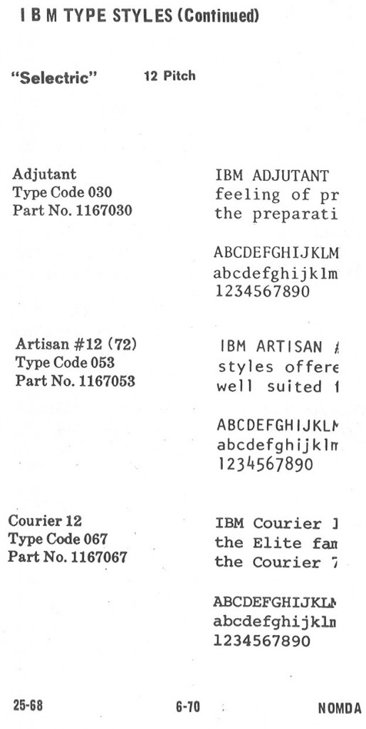
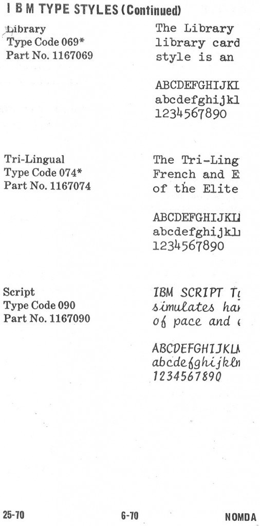
My Executive has the Mid-Century typeface (perfect name), and I created a Testimonial font using a typing sample from a friend.
I’m impressed with all the computer-readable typefaces available not just from IBM, but from other manufacturers too. I didn’t realize OCR was that advanced in 1964.
Thanks for posting all this stuff.
The Fifties and Sixties were truly the golden age of typewriting. All the typefaces from that era are so “Mod”.
Is it only me, or does Remington Paramount Pica look just like IBM Diplomat?
I think that Royal Book is my favorite, along with Olympia Congress.
These are great, thanks, thanks, thanks.
For the 15 years that I typed Selectrics, Mag Cards, etc., Bookface Academic was my favorite unless making carbons, where it was too heavy on the page. Sadly, IBM made a 12-pitch of BA back in the 60’s but I’ve never found the ball for one. My favorite on the Executive was Modern, but Arcadia was a close second. I used to own a French/English Model D that I bought from the French consulate in Houston, in that beautiful blue they sold. The trouble with Modern on the Executive was that the spacing was so different that unless the machine was tuned to the nth degree, it would be prone to piling letters. The Mid-Century that Richard P mentions above was much easier to keep ‘in tune’. Of course, Executives were always touchy, I’ve owned and used a pile, but what beautiful typing!
I was an IBM Office Products Division salesman back in the 1960s and made a great living selling IBM Selectric, Executive, Model D and Dec Tab typewriters. Without question work done on an Executive with Modern typestyle was the best looking ever producted. That typestyle was the standard of the legal profession and appellate briefs in Ohio had to be typed in that style.
Ever hear of a “cheater” rachet? Court reporters of old sold their transcription work by the page. They would buy Selectrics with a “cheater” rachet that produced 6.11 lines per inch, thus putting fewer lines on a page. Most untrained eyes could not see the difference.
Enjoy talking “typewriters” and still have a collection of Selectric Composer typing elements and Prestige Elite (Legal)typing elements that I’d like to sell. Some are still in their original shrink-wrapped packaging.
Also have a pristine 1983 50th Anniversary Selectric III that is in mint condition.
Interested? It just takes up space in my office.
Always nice to talk about the typewriter business with old pros. I started my sales career pumping gas at my Dad’s gas station and later worked for Sohio(the Standard Oil Company of Ohio). Then I sold typewriters before ascending to IBM management ranks.
I get a kick out of mentioning this to today’s young people under 30 since both jobs in my resume have become obsolete during my lifetime. And to think, we used to laugh at “buggy whip” salesmen !
Bill, I’m an ex-IBM CE retired as an IBM Service Executive and recently rediscoverd how much I enjoy working on old Selectrics. I happened across a 50th anniversery Selectric on ebay that I won. The only mention of this edition I’ve ever seen on the net is yours. I did find that IBM bought it’s first typewriter company with patents in 1933 so I assume that’s what it’s commemorating. Were you familiar with or did you sell this model back in the day or have any more information on it…how many, etc.
Always a pleasure working with the sales reps in our office and we always worked as partners.
Howdy Geoff, I should mention that you’ll find a lot of information on Selectrics and even the 50th anniversary edition by joining the Yahoo “Golfballtypewritershop” group:
http://dir.groups.yahoo.com/group/golfballtypewritershop/
Dear Reverend, does the NOMDA Blue Book contain, by any chance, VOSS typewriter serial numbers? Thank you.
I’m afraid not. I expect Voss probably didn’t have very many dealers in the United States, thus the NOMDA books wouldn’t have their fonts.
Thanks a lot for your quick answer.
I was stunned to find this website while researching IBM Selectric fonts. I have a Selectric in my storeroom that I was just going to toss, thinking they had no value. Now, I’ll definitely be checking which model it is and heading over to eBay!
I do have a question. Was there any font available for the IBM that was called, or resembled, New Times Roman, perhaps under a different name? I seem to recall that there was, but I can’t find any mention of it online.
I am looking for an IBM Executive with Modern (PM). I loved that type style. It was so nice and I recall it on docs from the 60’s and early 70’s. How I wished they made that style on Selectric Balls.
John
Cleveland,OH
Please where I can buy fonts for IBM Electronic Selectric Composer Fonts (Ball)
Thank you kindly for your help.
A. M. Nikolic
Toronto, Canada
ebay mostly. You’ll need to know what you’re looking for because they’ll almost invariably be listed as “Selectric I/II” balls. They have red lettering on the tops. Also be aware that most Composer balls have the extremely fragile release levers endemic to that specific era of IBM production, and every single one I’ve ever come across has been broken.
If you’re interested in the Composer, I have a guest post coming up written by a collector who recently restored his Composer, and it describes in detail a lot of the workings of this incredibly complex machine. (:
Hello!
After over two years of searching (should have looked into IBM typefaces when I discovered the IBM lead) thanks to this site I have finally discovered the name of the typeface used in the following image: http://myfonts-wtf.s3.amazonaws.com/2f/2f7dd97ab8e55adc99e09efe3631802a.178847.png
I believe it is one of the following Bold Face styles: http://munk.org/typecast/wp-content/uploads/2011/04/NOMDA-type-IBM-09.jpg or http://munk.org/typecast/wp-content/uploads/2011/04/NOMDA-type-IBM-10.jpg I believe the second is most likely due to the curve at the bottom of the lowercase ‘t’.
I was hoping that the Bold Face style types had been digitised, but unfortunately there is no evidence of this. ‘News 701’ bears some resemblance, though notable differences exist that preclude it as a satisfactory alternative.
I’ve been seriously considering the option of recreating the Bold Face style in digital format. The following document (‘IBM Electric Typewriters – Customer Engineering Manual of Instructions’ 16.8Mb) http://bitsavers.trailing-edge.com/pdf/ibm/typewriter/241-5155-0_IBM_Electric_Typewriters_CE_Manual_Of_Instruction_1953.pdf which incidentally has been prepared predominantly in Bold Face has some interesting descriptions of the type layout on page 32. Looking at the keyboard chart on page 36, it seems http://munk.org/typecast/wp-content/uploads/2011/04/NOMDA-type-IBM-09.jpg may actually be the Bold Face type I require.
My interest in Bold Face comes from its use in old U.S. Navy aircraft NATOPS manuals. These technical documents make use of a number of different typefaces, up to six in some instances some of which are very large in size such as those used for headings. So now, after my incessant ramblings I have some questions to ask and I would appreciate any help that can be offered :).
1) In a technical manual that includes illustrations, pictures and very large fonts (headings), how were these combined with the text from a typewriter?
2) These technical manuals often make use of special characters such as ‘√’ (square root), ‘°’ (degree), ‘ø’ (slashed zero), ‘<' (less than), '≈' (congruent to), '[]' (square brackets), '∆' (delta), 'θ' (theta (should be italicised)), 'α' (alpha (should be italicised)), 'β' (beta (should be italicised)), 'Ψ' (psi ((should be italicised)), & 'ө'. These symbols appear in the manual flowing smoothly with the Bold Face typeset, but are not listed as part of the Bold Face character set, so where do they come from and how are they applied?
3) Does anyone know where the Bold Face font originated? Was it designed specifically for IBM by IBM or an external source?
4) As I mentioned earlier I'm interesting in digitising the font so would like to acquire as much information about it as possible regarding size, spacing and other characteristics. Are there any particular places to search?
Is worth contacting IBM for details and will there like be copyright issues?
Thank you
Lee
1) I suspect they were prepared using the sort of large line-art cameras of the type I used to use in the printing industry back in the 80’s. If you wanted large type, you’d photograph your typeset page at an enlarged scale onto high-contrast negatives, and then “cut-n-paste” the different negative sections into a “mechanical layout” which was used to burn the metal photosensitive plates for printing. You could use this technique to produce any size type you needed from a single typeface.
2) Probably either a special typeface ball special-ordered from the factory, or perhaps special “rub-on” lettering that used to be prevalent back then, or simple cut-n-paste. “Stripping” (the term for the process of producing mechanicals by cut-n-paste) was a professional art back then, and I’ve seen guys who could line up small type so well you’d never know that different machines produced the type.
3) dunno about that. Usually typewriter manufacturers had their typefaces designed and produced by dedicated “Type Foundries”, companies that did nothing except design and produce type.
4) your guess is as good as mine there, IBM might be a good bet, but you’d have a job finding anyone still there who knows all about the product line of last century. Good luck! (:
Oh, and if your samples are proportionally spaced (IE: not monospaced), and date from before 1961, you should narrow your search to the IBM Executive typebar electric typewriter, not the Selectric. That would have been the only machine capable of that sort of work, other than a Varityper (which I assume you’ve already ruled out).
Thanks for you help Munk.
The document in question is from the mid 70’s, however I do have a document for another aircraft dated 1951 that also used proportionally spaced Bold Face No.1. I had never heard of the Varityper until you mentioned it :). I have only just started looking into typewriters because I had no knowledge of technical manuals being created that way, at least in part.
I have a document from 1980 which is a specifications manual that details how technical manuals should be compiled, including the style of type used. It states that the main body text should ‘be 10 point Modern or IBM Composer C-10M or equivalent’. This plus the impression I get of wide scale IBM typewriter use in the U.S Government of old, leads me to believe that an IBM machine is the source.
Ahh, by the 1980’s the Selectric Composer definitely would have been in use, it’s the incredibly complex version of the Selectric II that did proportional spacing. They’re rare now, very delicate and probably the pinnacle of electro-mechanical typewriter design. C-10M is certainly a ball that only works in a Composer. I have a few Composer balls, but not that one, and as of yet, no Composer to put them in.
oh, and certainly check out the Yahoo “GolfBallTypewriter” group forums, they (I believe) have a typeface catalog for the Composer in their file area, and maybe one for the Executive too. There’s also a handful of ex-IBM service techs that hang out there who would have a great deal more info than I do on IBM typefaces and machines.
I can’t seem to find that group munk. The closest to it is: https://groups.yahoo.com/neo/groups/golfballtypewritershop/info ?
that’s the place. (:
LOVE this site as I’m an old IBM typewriter lover…
I found that type style / font I always loved in ‘the day’ PM – Modern / Pica Modern / etc. It was the style in nice offices and used for some offset printing.
I finally found an Executive D with PM in beautiful condition. They’re delicate and hard to repair unless their in perfect condition. I found it!
THANKS
I FINALLY found that PERFECT IBM Executive D with PM (Modern). It’s in new condition!! How I love that old type style. Is there a duplicate in a FONT?
The typewriter could probably use a little new oil and grease, but I hate to touch it as it’s SO PERFECT
Cleveland
Hi, I have acquired nos IBM font balls 1167638, 1167628, 1167952, 1167937 and 1167957. I there any where I can look up what style and pitch these are? Thanks for any help,
well, the 1167 prefix says they’re 88 character Selectric 1/II balls, but elements in the 6xx and 9xx range appear to be “BCD” or “Binary Coded Decimal” elements, meant to be used with a special keyboard machine. I can’t find these specifiv inventory numbers in S241-5687-5, but the range suggests that’s what they are.
Thank you for keeping resources like this alive and well. Acquired my first executive that comes in testimonial type…beyond excited!
Just found this great website. I’m looking for a Model D Executive with Modern, Testimonial, Mid-Century, or other typeface of that era that is easily readable in legal documents. My “dream” machine would also have a red cover, but I know the red ones are hard to find. Thank you for your thoughts, and Happy Labor Day.
Hallo, what about arabic on IBM machines? Do you somebody know something?