While working on the “Typewriter Typefaces Bible” project, I’ve collected over 50 typeface references together spanning from 1915 through 1993. This is probably still just a thin sample of what was produced over those years, but it is still extremely useful in figuring out what typefaces were available during what years and on what machines. “Vertical Script” is a face that I’ve always been curious about, having seen it rarely on Underwoods and Smith-Coronas of the 40’s and 50’s. As the years passed since I first was intrigued by the face, I’ve seen reports and examples of the Vertical Script typeface on old Hammonds and 1960’s Olivettis as well. With my 50+ typeface references collected, I figured tonight would be a good time to try to trace the history of Vertical Script and figure out what makes and years of typewriters it’s likeliest to be found on.
We first see “Vertical Script” in a 1915 Hammond typeshuttles catalog, where it is listed as Shuttle #70. There are some characters different from later incarnations (curly quotes and such, which would be unique to the Hammond), but as far as the letterforms go, it’s identical to the sample we find in the 1928 Ransmayer-Rodrian catalog listed as “46 Ra Script Type”. Ransmayer lists this face as 1/10″ rather than in metric, suggesting that it was sold to U.S. market manufacturers and dealers.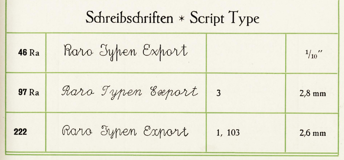
While Smith-Corona did adopt the 46 Ra typeface, it doesn’t appear in a 1931 Typeface Catalog for the 4-Bank Portable (Corona 4). Underwood appears to beat Smith-Corona by offering “Vertical Script” in a 1948 Typeface Catalog. Smith Corona is offering the typeface as “Script No. 46”, 10 Pitch by 1954.

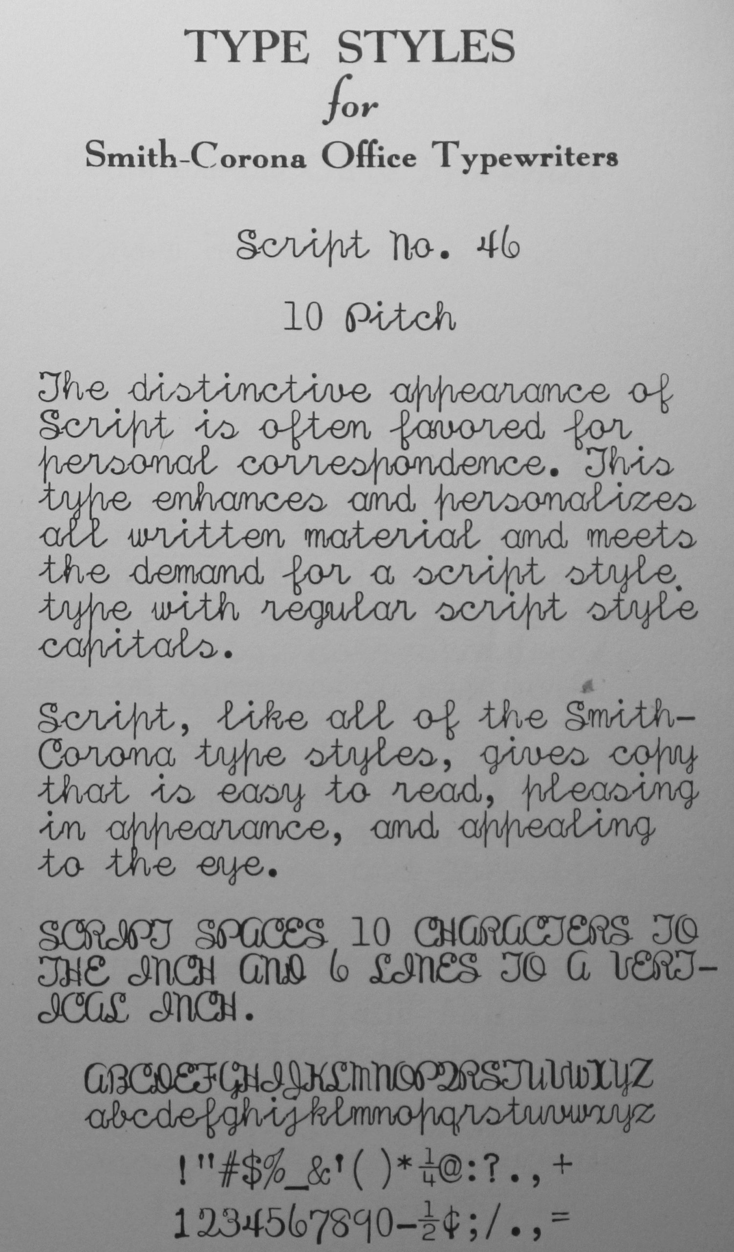
1956, 1957, 1964 NOMDA all contain listing for the typeface, offered by Underwood as “Vertical Script” and by Smith-Corona as “Script No. 46” and as “Medium Roman Script No. 32” with Medium Roman capitals and Script No. 46 lowercase letters, for *some* reason, I’m sure.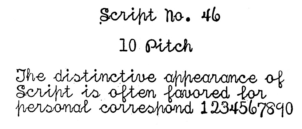
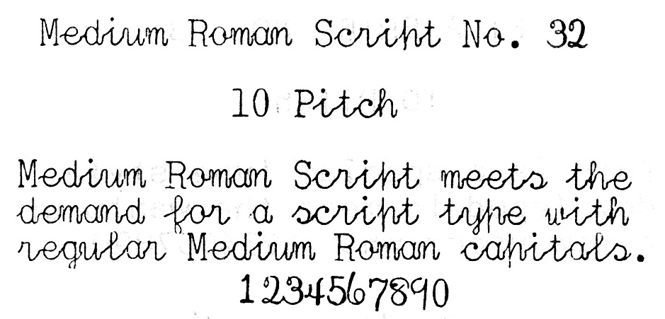
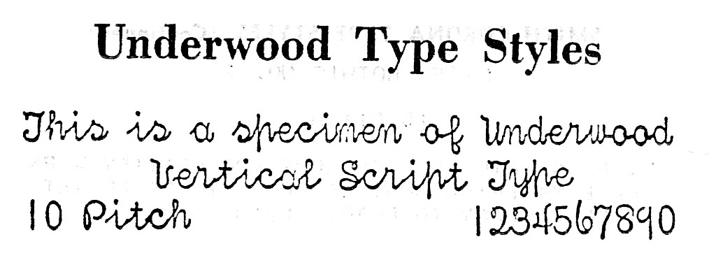
By the 1967 NOMDA Typeface Catalog, only the combined “Underwood Olivetti” is offering Vertical Script 46 Ra – but now it’s being called “Oxford Script”, and is still 10 Pitch. SCM no longer lists the typeface in NOMDA nor a 1968 Typeface Catalog. By 1970, Olivetti no longer lists it in catalogs. A 1970 RaRo catalog also no longer lists 46 Ra Script, so that would explain why it was no longer offered.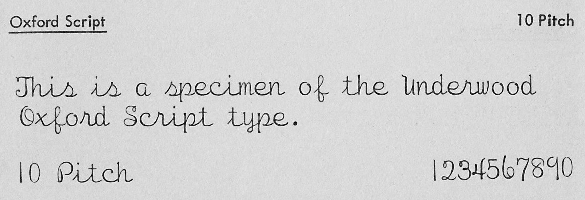
Oddly, SCM again lists Script No. 46 and No. 32 in the 1975 NOMDA edition, and Underwood lists Vertical Script as well, but it probably is just a case of NOMDA running an old typeface list, as the update dates are blank on these pages. The 1980 RaRo Type Catalog does not list 46 Ra. From the evidence collected, one might be able to say that the best chances to find a machine with Vertical Script on it is to look at Underwoods of the 40’s, 50’s and 60’s, Smith Coronas of the 50’s and 60’s, Olivettis of the 60’s & 70’s and among your old Hammond type shuttles. Of course, Ransmayer-Rodrian offered the typeface generally to manufacturers and dealers from at least 1928 through probably at least 1967, and any independent typewriter repair shop or dealer would have been able to specialty order the face and re-type nearly any machine that the slugs would fit on, so it probably wouldn’t be impossible to find the face on a Royal or other machine, but it would be very rare. Also, one should consider that the face was only ever offered in Imperial 10-Pitch, so it would be unusual to find it on a metric-based European machine, I would imagine.
It’s also interesting to note how different manufacturers gave the same face (possibly all from the same RaRo foundry) different names, but sometimes kept the Ransmayer catalog number attached to that name. I feel like I will probably do posts on other Script typefaces, just to get the naming a bit clearer and maybe encourage collectors to use the proper names for script faces rather than calling them all “script” or “cursive”. There is a certain specificity level that can be reached, and I’ll be doing my part to help you reach it. (:

Regarding the typeslug markings, I have no examples to examine, but I suspect that if you do have a machine with Vertical Script on it, the typeslug markings would be “46” or the Ransmayer “R in a stop sign” mark plus “46”. Please comment if you find this to be the case (or not the case) on your example.
German collector Kilian Rümmler says:
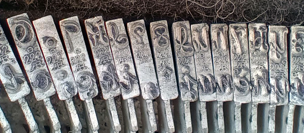
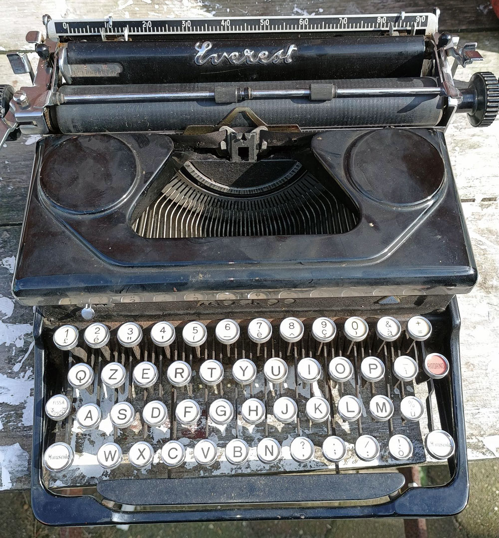
I have this Ro222 (AR) on a 1940 Everest mod. 90.
I wonder if the 222 is also a true vertical script type?
Are there any other known typewriters with this typeface?I have attached a few photos, a typeface specimen and a picture of the machine as I found it.
My 1958 5TE vertical script typeslugs have three different marks, none with the “R” in a stop sign. The majority have 4 then 6 on either side of a circled HK then four with “3” on one side and two with “1” on one side of the HK.
I am just checking in a 1954 Smith-Corona Silent Super. It has ‘vertical script’with the same circle HK with 4 on left side of circle and 6 on the right.
I don’t know if you’ve mentioned the Typefaces Bible project before. It’ll be a great help, not just for my own reference, but to correct some of the common misapprehensions I see out there about typewriter typefaces—that their typewriter is outfitted with Courier, that pica and elite are fonts, and so on. I can’t wait!
Thanks for tracing this style through the literature!
I’m very interested in learning more about the type foundries that created the typeface designs for typewriters (being a font designer myself). How broad was Ransmayer-Rodrian’s reach? Did they provide typefaces to most manufacturers? Did they even go back to the Hammond shuttles? Was aftermarket customization much of a thing?
Interesting to see the evolution, too. E.g. looking at the lowercase p in the NOMDA catalogs looks like a combination of 46 Ra and 222 from the 1928 RaRo catalog (the 46 Ra from the 1928 catalog is narrower and has a lot more variation in thick/thin strokes than “Script no. 46” from NOMDA, and 222 has a similar width and monolinear feel as “Script no. 46”, but with slightly different forms). And the capitals for Modern Roman Script no. 32 look like normal roman caps, not script ones like in no. 46.
If this is all one foundry, then it indicates deliberate design shifts. I wonder if it was due to market demand, manufacturer request (house style?), or technical issues (a bit like Linotypes couldn’t kern, so the lowercase f’s in most Linotype fonts are designed to avoid the need to kern).
The Oxford Script looks like quite a departure from the others. The letterforms fit the space much better. The lowercase h, p, e, m, n, t, and y are different. I wonder if this is just continued evolution (a new designer instructed to “freshen up” an existing design), or … Whatever the reason, I quite like this one.
Very much looking forward to your upcoming Typewriter Typefaces Bible!
The Typewriter Typefaces Bible sounds like a wicked challenge. I’d be lying if I said I wasn’t excited about it. Good stuff!
Roman capitals script is weird, but I’d still be happy to find one. I’m super excited about the new Typeface Bible! Are you including Selectrics and daisywheels too?
Thank you for piecing this information together. It’s fascinating stuff. I must say, though, that it’s a typeface that is a little hard on the eyes. Of course, that wouldn’t stop me from adding one to my collection!
After a long search, I got my hands on an Erika 5 with what they called “Consularschrift”. The code on the typelugs is 107. It is very close to Smith Corona and Underwood Vertical Script, but there are small differences, especially in the capital letters. And the numbers are more “even”. If you don’t have it I can send you high resolution images of the font. And it has the German “ß”
Of course it should be typeface and not font. This happens when you let a computer make a spell check….
It is especially pleasing, to see that the Shuttle #70, is exactly identical to the cursive letters I was taught in fourth grade in Longueuil, Québec, in 1976.
It is worth mentioning that this was the same shape of cursive that had been taught to my parents as well in the 1940s, by the catholic nuns and brothers in the province of Québec.
I have the Hammond #70. it types 12 characters per inch. I would live to find a machine with 97 Ra shown in your chart above. I hope you will include the Royal Script and its proper designation in your script article. I find it much nicer to look at the #75 or even #69 Script. Thanks for your work.
I enjoyed this post. My 1949 Smith Corona Sterling: s/n 5A152478 has 10 pitch vertical script type slugs. Like the others who commented, the slugs have HK enclosed in a circle in the center and 4 on the left and 6
On the right.
If you would like a photo, let me know and I will be happy to provide one.
This machine was my first ever typewriter purchase in 2020, and I caught the bug.
Very cool to read this and learn more about the typeface surprise I received on this 1960 Remington Quiet-Riter Eleven from an eBay gamble. There is one other like it in TWDB that I can see. https://typewriterdatabase.com/1960-remington-quietriter-eleven.18744.typewriter
It may just be me, but that Smith-Corona Script No. 46 looks like printing from someone with shaky hands… kind of like how my late aunt’s cursive handwriting got in the autumn of her years.