Please submit your typewriter fonts to Google Web Fonts!
Google Web Fonts is a resource that allows webmasters to embed fonts in your web pages (or blog) and use the fonts in text on your page. I use one font for the titles on my blog, and at least one other typospherian I think is using GWF for his blog.
Wouldn’t it be super-cool to be able to embed typewriter fonts and use them for the body copy of our pages? It can happen, if those of you who’ve authored typewriter fonts submit them to Google! (:
(please, please, please?)
UPDATE: Ha! I just checked out the font list and it looks like the latest approved font is a typewriter font!
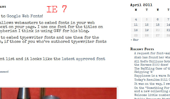
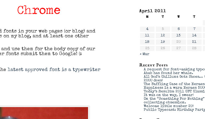
UPDATE: Guh, tried out the existing typewriter font and it looks awful in Chrome and Firefox 3.x – it annoys the crap out of me when IE does something better than other browsers do:
Update yet again: Ok, figured out why IE looks good and other browsers don’t: it’s a Windows thing where IE smooths fonts automatically regardless of the Windows OS settings for Cleartype rendering. All other browsers default to the OS’s setting, which is usually by default set to off. This is one of those things that drive web developers batshit crazy. An awesome way to deliver lightweight high-quality fonts to the end user which can’t be used because most people have the ability turned off by default. GRRRR!
BTW: if you want to turn on high-quality font anti-aliasing on in your Windows OS, right-click on the desktop and select “Properties”, then pick the “Appearance” tab and click the “Effects” button. Make sure the “Use the following method to smooth edges of screen fonts” checkbox is checked and select “ClearType” in the select box below it. Then hit “OK” and “Apply”. Once you do that fonts will look much better in *all* of your browsers.


OK, I let them know about my typewriter font page. Now I guess the ball is in their court.
Wow. A friendly person from Google contacted me within 15 minutes and we just spoke by phone. He likes my fonts and will be reviewing and tweaking them. Thanks for the tip!
PS: Whatever font you’re using right now looks great on my Safari 4.1.3 browser.
Yeah, problem is with Firefox, Chrome and Opera on Windows XP (and possibly 7). Bad implementation of subpixel rendering engines and those browsers default to using the faulty OS rendering. It’ll look great in IE on windows and any browser on a Mac or Linux. Been trying various CSS fixes without success. ):
The only workaround I know for avoiding the horrible Windows font rendering, is to install a program called gdipp. But IMHO is too much hassle, and I simply switched to Ubuntu. :)
I kind of lost interest in Ubuntu after the last update that introduced that horrible desktop UI. I could never get the audio to work right anyway. Lately I’ve been installing CentOS instead, when I want a Linux box around. Much easier to set up as a multi-account webserver for project testing.