From: “1950 – Specimens of Type Faces in the United States Government Printing Office”  Heh, don’t judge me about the weird things I read. :D
Until now, I was not aware that there was a version of Vogue that was made for letterpress work. It was made by the Intertype foundry and was used by the US Government printing office in their print shops. It is, as far as I can see identical to Royal Vogue, and the Everest/Olivetti Simplicitas & Ransmayer-Rodrian RA 280 Moderne Pica. So, collectors – keep an eye out for letterpress type cases full of Vogue!
So, ummm. I obviously have a scan of Vogue Oblique (italic) and Bold, which have never existed on any typewriter. Anyone want to turn ’em into a Selectric Element? :D 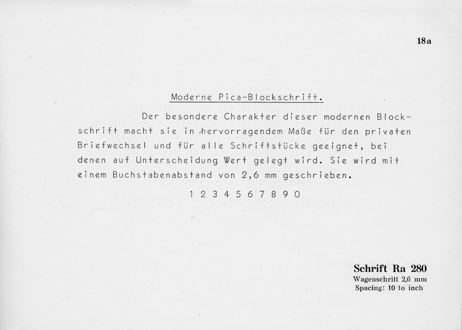 Currently in the earholes: (from Gregory)
It’s disheartening to see that 14 pt and up only showcase a partial lowercase alphabet, sacrificed for the f-combos. Is it really that important to show how the f pairs with other tall characters? “fi fl ff ffi ffl” Regardless, type samples are always a graphic designer’s delight! And that typeface family deserves all the love it gets.
Those, strangely, are apparently required characters in typesetting. Even the Varityper has keys for 3 of those ligatures, sometimes omitting useful punctuation.
I don’t think that’s identical to Royal Vogue, strictly speaking.
Certainly, it’s also designed to be proportionally spaced rather than monospaced. Still, it a Vogue variation for those who love Vogue, and the US Government Printing Office used it in the 1950’s. (also 2 kinds of swastika borders for some reason). Curious to see what sort of documents this typeface was used on.
Agreed. Not Vogue, sensu stricto. It’s better than Vogue. As is Ro 280. ;) Vogue is a poor rip off of Ro 280, just like Royal Contemporary Pica and Elite are a poor rip off of IBM Artisan 10 and 12. Simplicitas is a whole different animal than Vogue.
The g is not quite the same as the Royal’s.