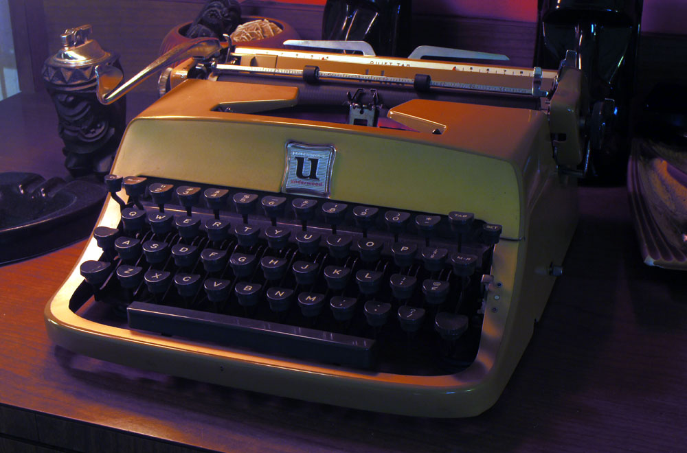
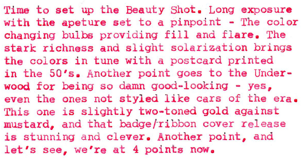
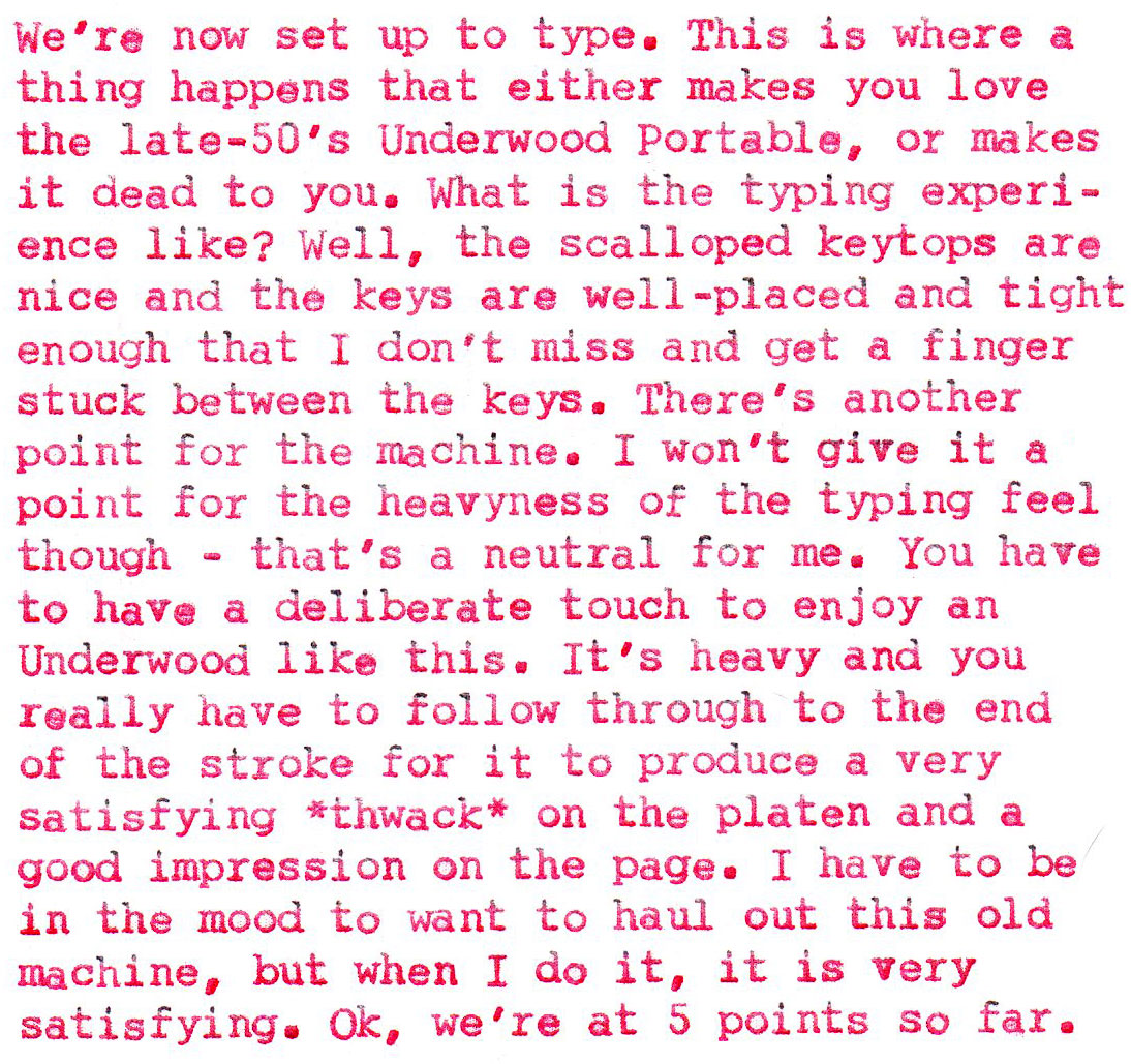
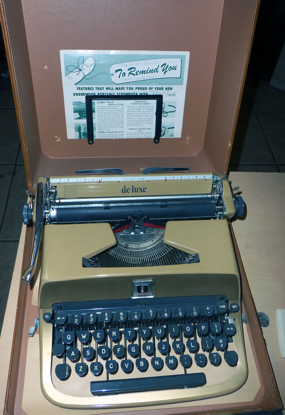
Weapon of Choice: “Tex”, 1957 Underwood Quiet Tab Deluxe (Golden Touch)
Richard Polt’s post on his Typewriter Safari, which prompted thoughts on the Underwood Crest.
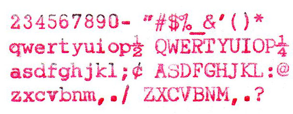
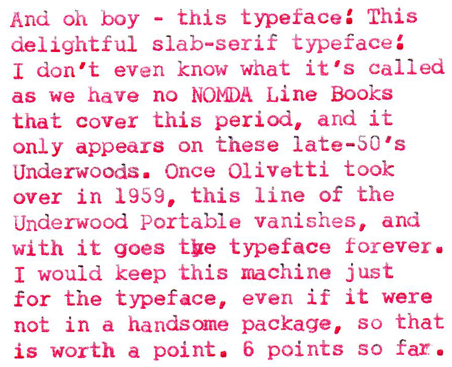
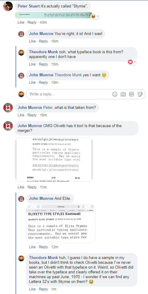
UPDATE: This post came up in the Facebook ATC, prompting a discussion of this typeface, which I called “Slab-Serif”. Turns out the real name of the typeface is “Stymie”, and also that Olivetti continued to offer Stymie on its machines up past June, 1970 – as John Monroe found out when he checked under Olivetti in the NOMDA examples posted here. The hunt is on for a Lettera 32 bearing the Stymie slab-serif typeface.
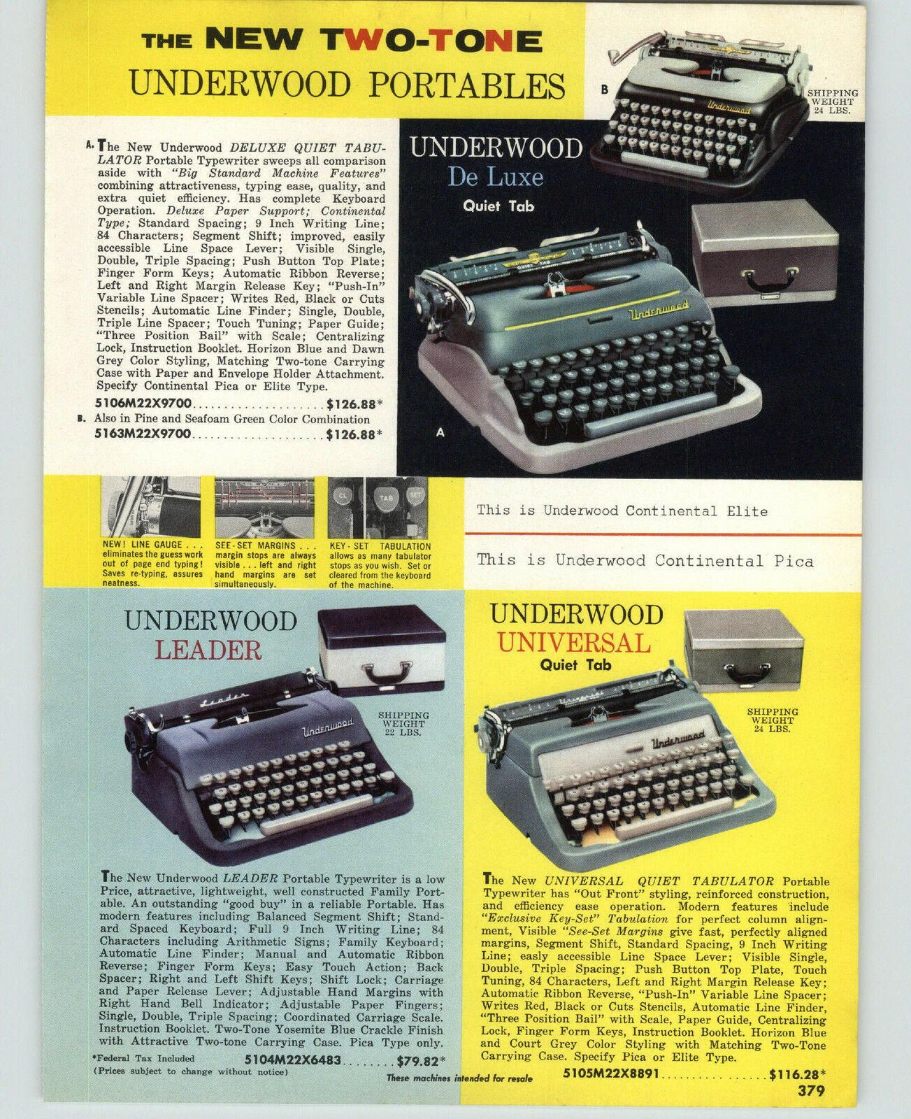
Further Update: 2023-03-08: A commenter below notes this undated Underwood Portables ad which refers to this typeface as “Continental”. While undated, these models would have been around the same mid-50’s time period as Tex, probably a year or so earlier.
Now you’re on a roll. You’ll have to do this points system review to all your machines.
I like your points system. I have an Underwood ACE from the 50s that I use infrequently. It needs a bit of work to get it to the point I like of all my typewriters. As to several Typoshereians no liking the 1950s Underwoods it may be the same as why I do not like many H3k machines. I like the looks of the square H3k, but dislike its typing characteristics. The rounded H3k typewriters are not as visually appealing to me, but he typing on all I’ve used is great. Now for the Underwoods WWII and before I find to be great typing and somewhat stylish the later more of a boring style and not quite as good typers. I do like the styling of many of the portables and hope to add them to my collection should any be found at the right price. After Olivetti; well they are still an Olivetti.
True, the typing experience is sub-par. if I’m in the mood, I’ll put in a few pages, but my fingers ache a little afterwards. Wouldn’t want one of these as my *only* machine, or even my *main* machine, but as an occasional use machine, it has merits. (:
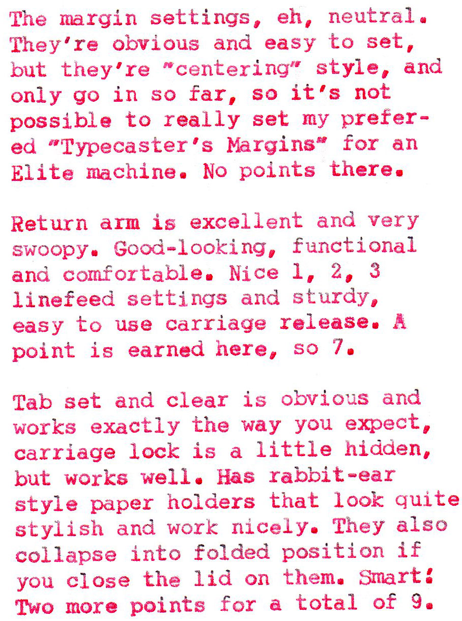
You make several good points. Lots of ’50s Underwood portables have fun designs, and I also love that typeface. But . . . . . look at the (mis)alignment. Look at the chintzy materials used for important parts. Look at how easily they fall apart and degrade. The carriage-shifted Underwood portables were simply made better. I don’t know what precipitated this decline in quality, but it’s noticeable. If only Olympia had manufactured these Underwoods, then they’d be outstanding!
but I *like* quirky misalignment on my machines. :D
I enjoyed your points system also. The type style is good looking as is the mid-fifties Quiet Tabs. I haven’ really paid much attention to this model … so consider me educated and curious.
Great review, I haven’t seen these an awful lot here in the U.K. I love that typeface.
Your point-based review is so good. I love the looks of this Quiet Tab – especially the large “U” badge. It’s the typewriter equivalent of a humongous belt buckle – such excellent swagger.
+1 on your points system which is worthy of a bit of formalization to embrace all the typewriters in my own collection. The real reason I’m commenting isn’t off-topic, because you mentioned your wonderful typecasting margins: I just learned that when reading this blog on my iPhone and turning it to landscape orientation, it expands to fill the display exactly with a corresponding enlargement of the text for my aging eyes. Thank you (and Apple, as appropriate)!
I really appreciate your site. It’s a fantastic resource. In that spirit I’d like to add further information on the Underwood typeface called Stymie. It’s actually referred to as “Continental” in an earlier ad for their 2 beautiful Quiet De Luxe models of 56-57 or 58? that predates the Olivetti named “Stymie”. An actual type sample as well as ordering instructions are provided in the ad. (see link)
Another bit of information in the linked ad is that the well known “black and white” Quiet Tab is actually very dark green and very light green called in the ad Pine and Seafood green respectively.
I hope you find this interesting.
https://www.dropbox.com/s/52qgvhky2e7b3uq/1957-PAPER-AD-Underwood-Portable-Typewriter-Deluxe-Leadedr.jpg?dl=0
Further updated post, thank you! (: