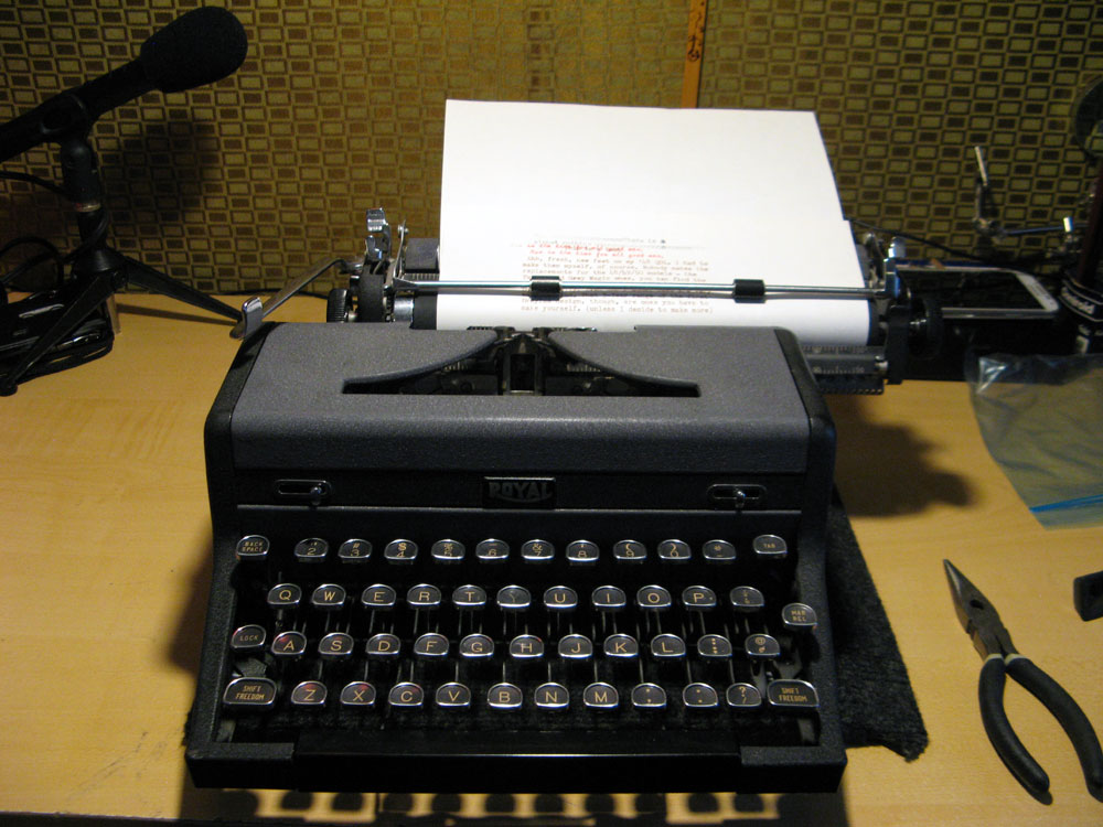
Weapon of Choice: “Moneypenny” 1948 Royal Quiet De Luxe #A-1551567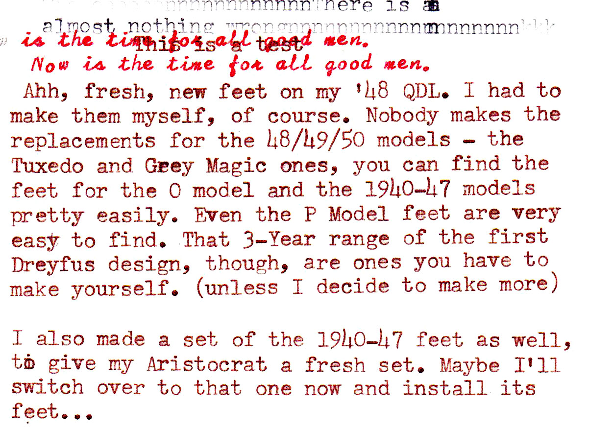
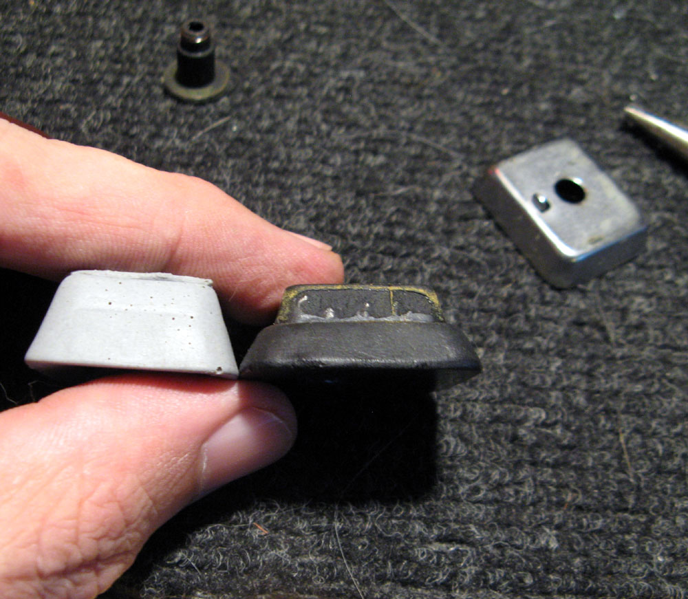
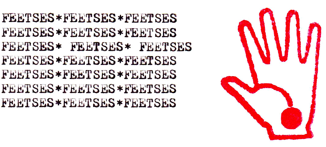
The old ones were so squished that it was hard to get the machine out of its case – the feet would get stuck in the lid detatchment mechanism.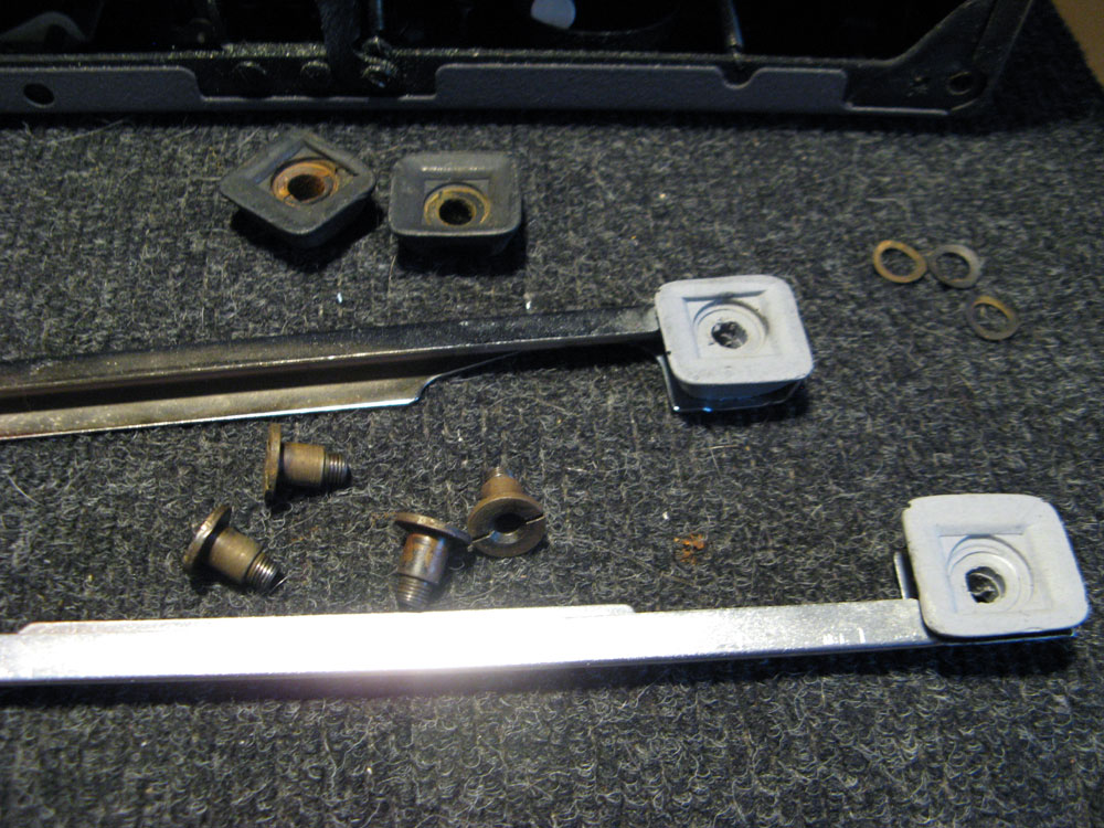
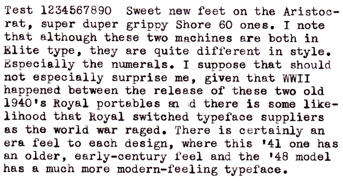
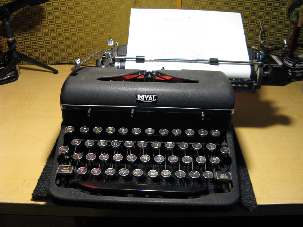
Weapon of Choice: 1940 Royal Aristocrat #B-957437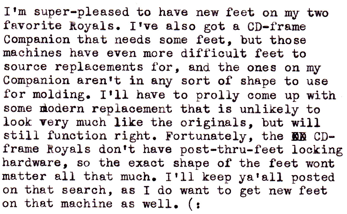
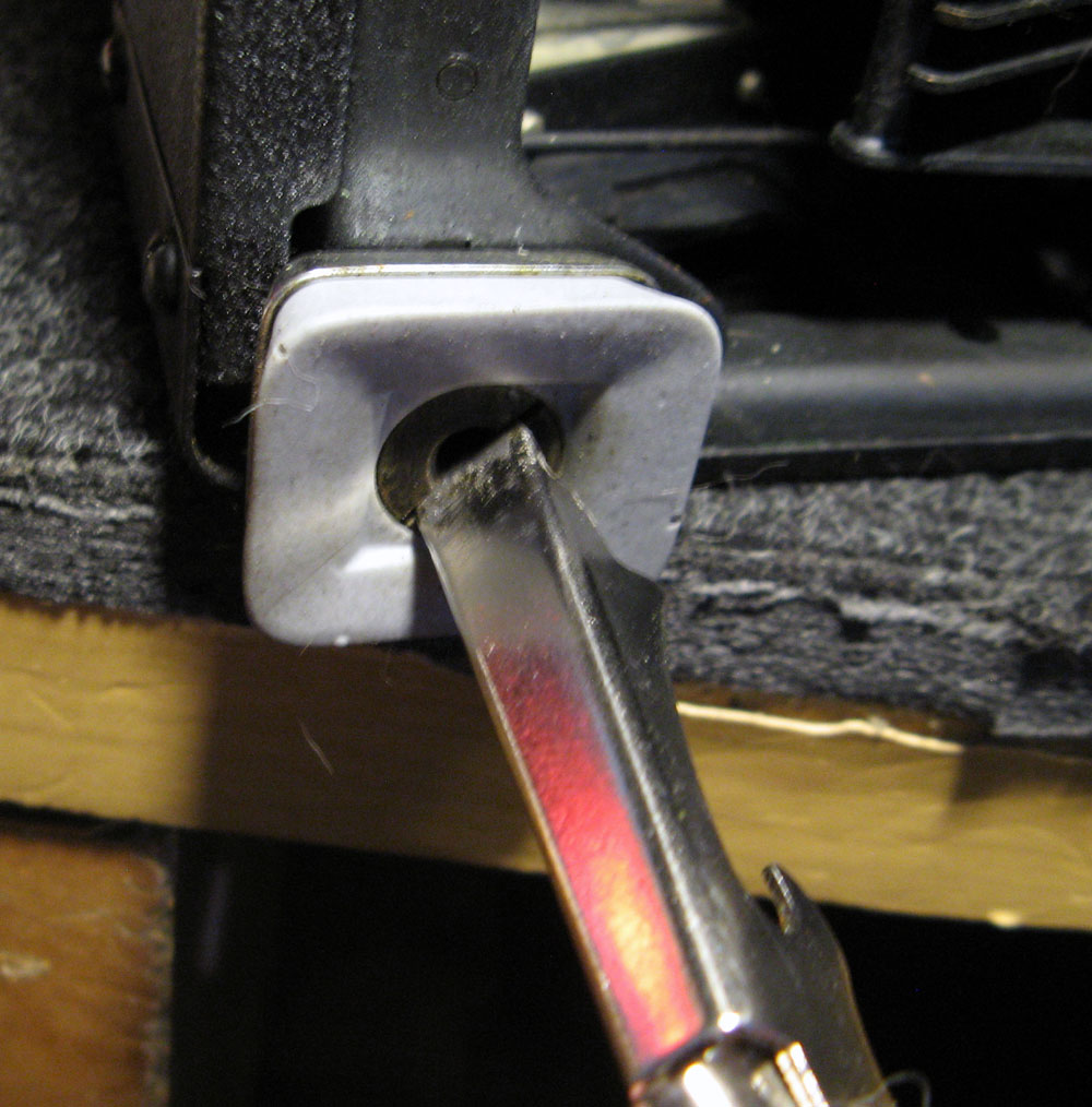
Gettin’ good use out of the tool we made a few days ago… (: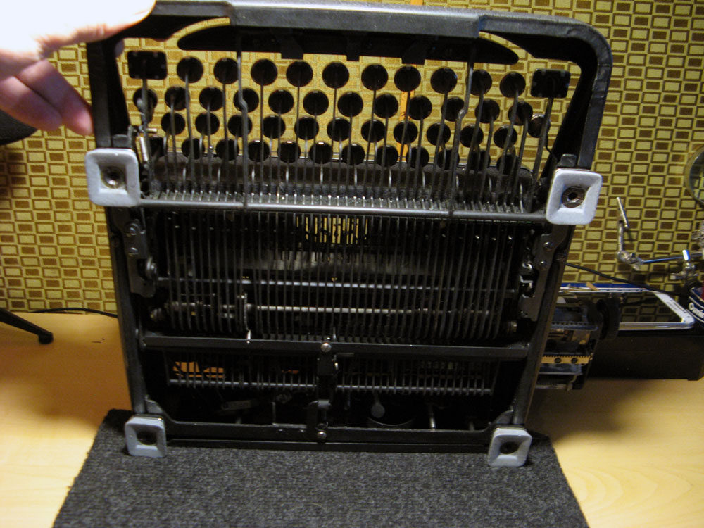
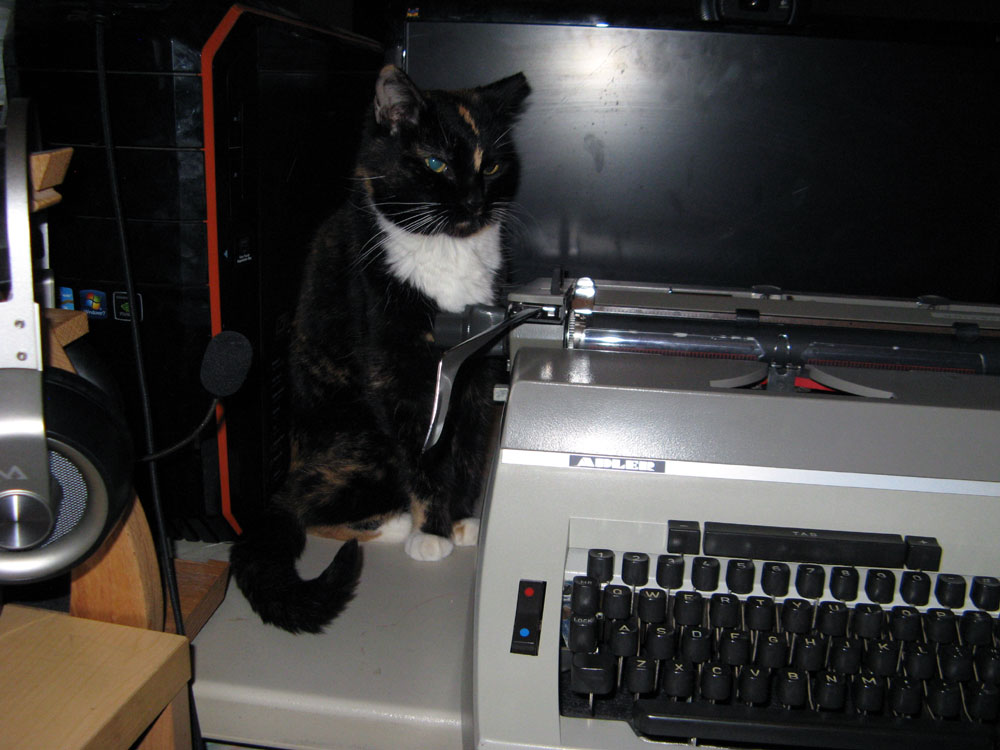
I put the big Adler on my videocasting table for TCL this morning, but the cat wasn’t happy about it.
For what it’s worth, of the nine Royals I’ve owned that were manufactured between 1941 and and 1954, the only one that used the old-style typeface was a 1946 QDL. Not having noticed the different typeface until now, I passed it on a year and a half ago as a duplicate machine, which gives me a sinking feeling, since I prefer the older style.
Congrats on the feets!
The old style numerals on Pre-WWII typewriters are hard to beat.
I’m staying tuned to find out exactly what a CD-frame Companion looks like. I’m drawing a blank on what the CD may stand for.
Here’s a CD frame. Looks a lot like a normal A-Frame QDL of similar vintage, but is a little smaller, carriage-shifted and the adjustments are somewhat more primitive. This is the frame that the so-called “Depression-era” Royal Portables were made on.
https://typewriterdatabase.com/1941-royal-companion.15.typewriter
Nice job on the fresh feetses! I’m on the lookout for a good looking Moneypenny too. I need to round out my Royal collection. My 1920s, ’30s, then ’50s need a ’40s in the family!