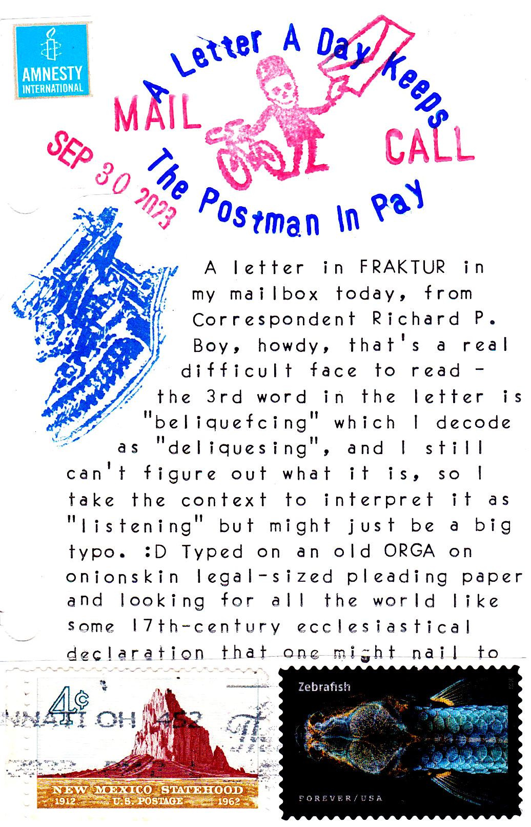
 …a church door. (heh, ran out of room there) Here’s the first line with the word I think is “listening”, but I’m really not at all sure. :D
 Currently in the earholes:
…a church door. (heh, ran out of room there) Here’s the first line with the word I think is “listening”, but I’m really not at all sure. :D
Currently in the earholes:
I always read those “long s” as an “f” when I see a Fraktur text. Almost as if the author has a lisp =D
While I can appreciate the rarity of Fraktur, I would not enjoy reading a lengthy document using that design. Ironically (or perhaps not), so many of the font designs that people pine for when it comes to typewriters make for suboptimal text presentation as far a readability is concerned.
To quote Lynn Johansen’s wise words: “Sometimes there’s a hidden wisdom in what becomes the boring standard.”
Hi, Bill! I love Lynn’s quote. Thanks for sharing!
Fraktur. One of the 2 ever elusive typefaces for my collection. I really like it and don’t find it as difficult to read as old English from the 1700s. One day I hope to add a Fraktur machine and a Hermes Epoca.
heh, be patient – I am certain someone’s going to put true Fraktur on a 3D printed Selectric element sometime soonish. :D
I am deliquescing in the sounds of Episode 6.
I am “absorbing” the sounds of Episode 6.
aha! I have learned a new word! :D
“Deliquesce definition, to become liquid by absorbing moisture from the air, as certain salts.”
Hope you enjoyed the visual/cerebral workout!
We do “need” a Fraktur Selectric element.