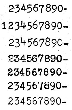
Where these fonts all seem to differ quite wildly is the style of the numbers. Here they are all together.
So, if “Pica” is a size, or more specifically any 10 CPI font face on a typewriter, then what is the typestyle that most of us know as “Pica”? Is it Courier, or does it have a name at all, or is it just designated as numbers by different factories?
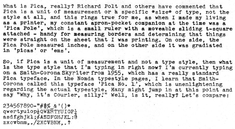
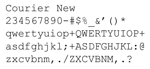


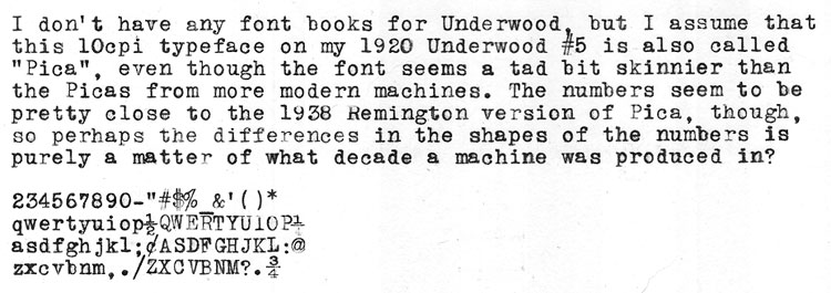

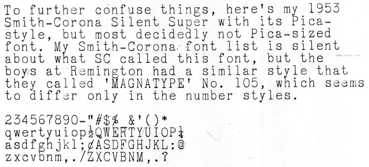
Thanks for putting these type samples up for easy comparison, and for raising a good question.
I frankly don’t think there is such a thing as THE typestyle we call Pica. Admittedly the numerals are where these typing samples differ the most, but I see differences in some letters too, most noticeable perhaps in the little “a.” (Compare the potbellied SCM “a” to the more demure Remington “a” in the next typing sample.) There is a high degree of similarity between these typefaces, but they’re not identical.
I reviewed your very useful NOMDA style books and see that many manufacturers called their basic typeface “Pica” (at least when it was 10 cpi). But are all Picas exactly the same Pica? I don’t think so.
To further complicate things, I’ve heard that there were type companies that provided type ready-made to (some) typewriter manufacturers, so the same typeface might show up on typewriters from two different companies. Then those companies might give the typeface different names! When you look closely at a typehead you can sometimes see a mark that cryptically indicates its manufacturer.
And I thought deciphering Hermes type faces was confusing……
Great post. Thank you for all of the comparisons. I probably think like most: Elite 12 c.p.i., Pica 10 c.p.i. as learned from typing class, but with variances for both and little consideration for the actual type style. If I could only remember what I learned in printing class and from the short time I worked in a local job shop (printer). Since becoming interested in typewriters I’m more interested in the typeface or style and really not as much in pica or elite.
Yep. The reference to pica is a little confusing when related to typewriters. I always used it when measuring type to mean 12points, in absolutes, that’s roughly 4.2mm. And after all these years doing typography on a Mac, I still think in multiples of 12pt and almost by default deploy one-and-a-half pica column gutters for newsletter work: 6.3mm. And on the other side of my metric steel ruler, yep, 12pt increments – a pica scale :-)
It’s good to see this topic finally baldly exposed! I am going to claim some authority here, because I worked as a typewriter salesman in the ’70s (Smith Corona and Olivetti) and even more to the point, I have an long-established career in book design, relying heavily on a knowledge of typography.
To be brief and absolute–in the typewriter world, “pica” strictly means nothing more definite than “10 characters per inch” and “elite” means nothing more than “12 characters per inch”. It was and still should be a simple way of letting customers know that a typewriter printed largeish or smallish letters on the page. (Note all the Smith Corona models with 10 or 12 in their names.) Both sizes usually print out 6 lines per vertical inch.
(In the graphic arts and typography fields, “pica” is a measurement amounting to 1/6 of an inch, and this is unrelated to anything in the typewriter realm.)
The use of the word “Pica” in the names of typefaces is a purely proprietary and idiosyncratic practice, applied according to the whim of the manufacturer; there is no definitive Pica typeface, nor an Elite one for that matter. It is simply a question of how many characters you can fit on a line and the related idea of whether you want your page to look dense (elite) or airier (pica) or if you are a student, how quickly you can fill up ten pages (pica is faster).
The look, the style of the letter shapes is an entirely different question and you are right to look at the tiny differences in the shapes of the serifs or the angle and length of the tail of the “Q” and so on, to distinguish the typefaces, but do so without relying on the simple names of those faces. (I have about 15 different “Garamond”s on my computer and I have to specify Simoncini Garamond, or Garamond Three, or Adobe Garamond Pro as opposed to Adobe Garamond, etc. when conferring with clients and printers. Times is different from Times New Roman, etc. Adobe’s Courier is different from Bitstream’s Courier, etc.) Probably the best practice for us to follow in carefully referring to typestyles is to use the tiny codes cast into the type slugs. They are not comparable nor consistent across manufacturers but at least they are unique. We might also use the NOMDA tables and be careful to specify the full name carefully spelled together with the manufacturer. Or just compare samples–that would be the most fun.
I know almost nothing about European practice, but I don’t think they use “elite” and “pica” anyway and I wouldn’t expect them to measure characters per “inch”. What does 11 cpi work out to in a metric length? Do they design to metric standards and then put English scales on the export carriages?
This suggests a quick way to determine whether a flea market find is pica or elite: just note whether the carriage scale has a 10 or a 12 at the inch mark.
Enough. I stopped being brief at paragraph four. Maybe I should have been a writer…
Michael Höhne
Thanks for this educational piece, Ted.
I’ve been completely clueless about the real meaning of Pica/Elite until I read your post. I really thought they were typestyles.
Thought you’d all enjoy this passage from my novel “Nature Bats Last.” “Smitty’s whole name.
My typewriter’s whole name is “Smitty ‘The Pike’ Corona.” Smitty is obvious. ‘The Pike,’ because Smitty’s font is called Pica. A pike is both a nasty pointy weapon as well as a nasty pointy fish named after the nasty pointy weapon. The pike (fish) is covered in slime. It will also eat just about anything including each other. (Pike nicknames are wonderful: “Snot rocket,” “Slime snake,” “Sharptooth McGraw,” “Water wolves”). Ironically coincidentally Pica is also the name of an eating disorder in humans that causes people to consume paper, clay, metal, chalk, soil, glass, sand human shit; pretty much everything we’re not supposed to eat. Also in keeping with the “what is reality theme” there is no real typestyle called “Pica.” It differs from typewriter to typewriter. Third, the whole name, ‘Smitty ‘The Pike’ Corona’ sounds like mob muscle. I’m the brains, Smitty The Pike is the enforcer. We jump people in dark mind alleys, steal their ignorance and beat them to death with the truth.”
Although this page has useful and interesting information, unfortunately it is composed almost entirely of JPEG image paste-ups, and its content is, therefore, inaccessible to search engines. I’m not sure how I found it, as the search term I entered was “difference between pica and elite typefaces”. Examination of the HTML source code shows most of the text in the page to be in the earlier comments, and perhaps that’s how it got indexed by the search engine. The page doesn’t even have a meta tag with keywords. To get around such problems, it might be a good idea to take the text from such typewriter sample images and put it into the “alt” tag of each image. Search engines crawl and index such tags, and there is no upper limit on the number of characters they can hold.
You’re a real “can’t see the trees for the forest” sort, aren’t ya? :D
What’s that supposed to mean? His feedback was perfectly valid, and I dare say quite valuable. Even if it wasn’t, I don’t see how that suggests that he can’t see the forest for the trees.
Interestingly, your Empire Aristocrat sample is the one that most closely resembles a sample I saw of the Underwood 256: https://typewriterdatabase.com/1975-underwood-256.16960.typewriter
To correct a comment made by Michael H. above: “(Note all the Smith Corona models with 10 or 12 in their names.)”
The 10 or 12 in Smith-Corona model names have nothing to do with the typeface. They denote the length of the platen (10-inch or 12-inch). For example, I have two Smith-Corona Classic 12’s – one with a pica typeface (10cpi) and the other with elite (12 cpi). Both have 12-inch platens, thus the model names.
My 1933 Royal Model 10 has elite type. I use it occasionally to address envelopes. Incidentally, I was manufactured in 1933 as well.
Oops! It is pica. My bad. (I could blame it on senility but I’ve had it since puberty.) I occasionally see my Royal in old b&w movies.