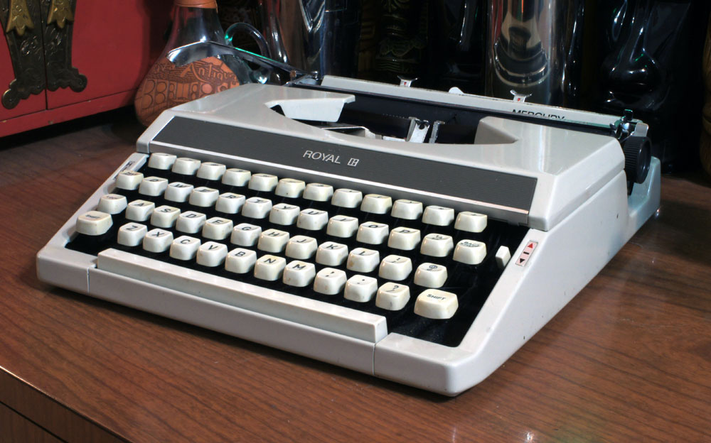
Weapon of Choice: 1972 Royal Mercury – Excellent double-striker!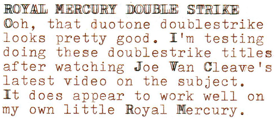
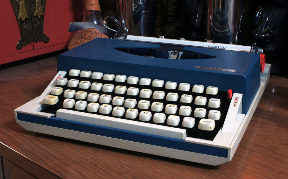
Weapon of Choice: 1970 Royal Sprite – Excellent double-striker!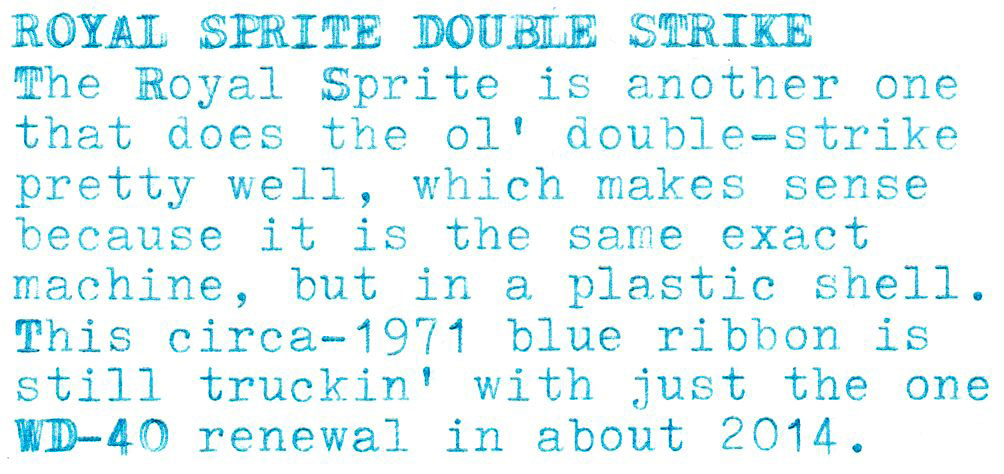
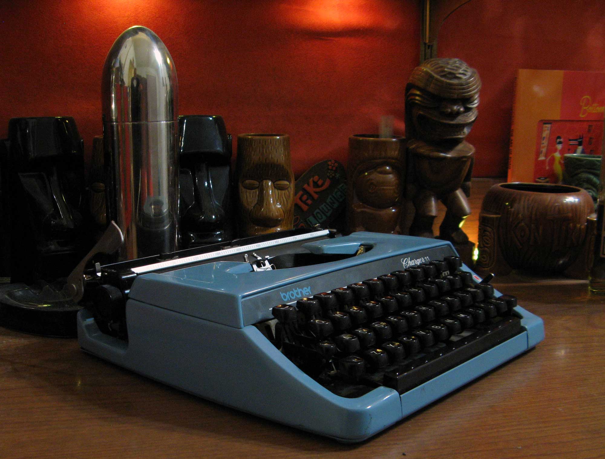
Weapon of Choice: 1978 Brother Charger 11 – Bad double-striker.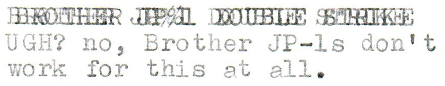
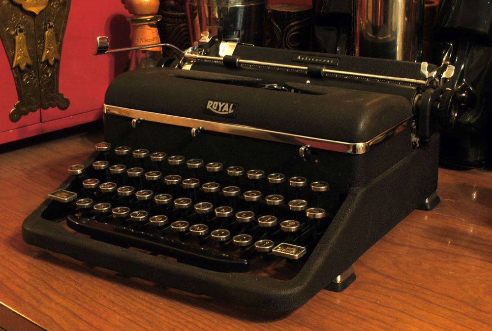
Weapon of Choice: 1940 Royal Aristocrat – Decent double-striker.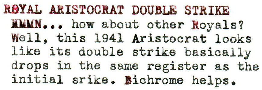
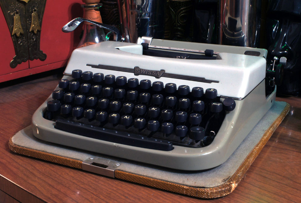
Weapon of Choice: 1961 Swissa Junior – Decent double-striker.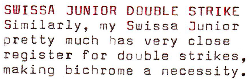
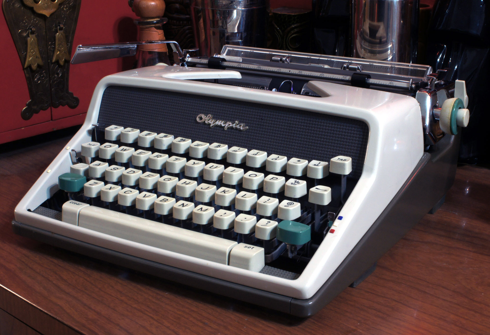
Weapon of Choice: 1963 Olympia SM-7 – Bad double-striker.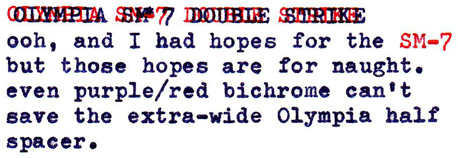
Weapon of Choice: 1962 Triumph Perfekt – Decent double-striker.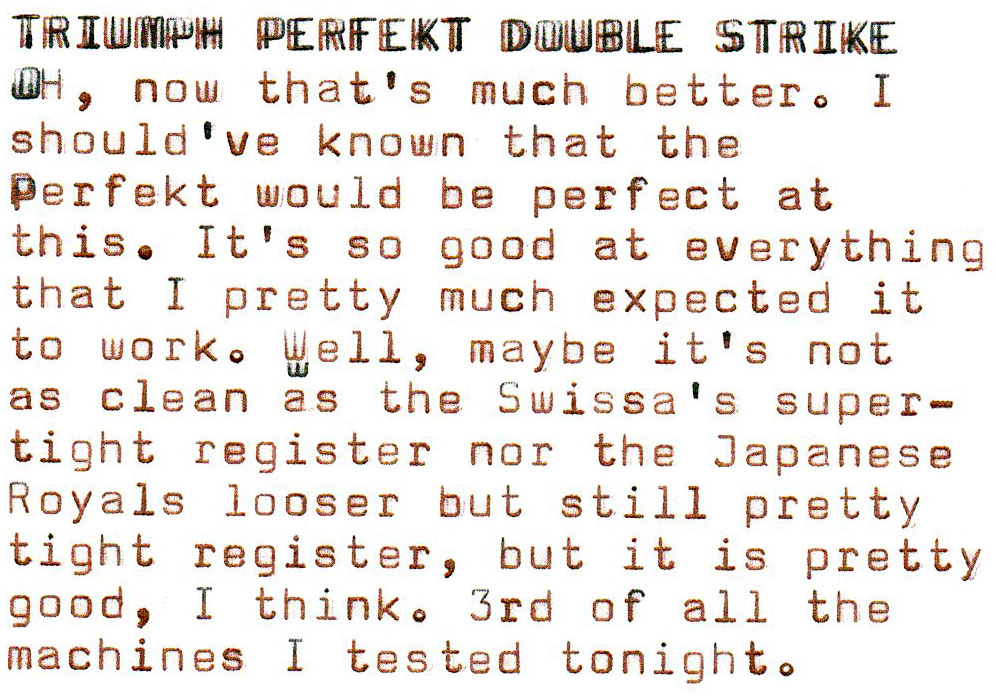
What the heck am I talking about? Watch this!
The Swissa & Royal are the only ones easily read. I never played around with bolding any characters other than repeatedly backspacing and striking the same over and over until it got darker than the surrounding letters/words.
Stay safe & happy typing.
Huh.. I rated those lower mainly because the double-strike is not notably different than if I’d just typed directly over the previous letters and not used the “hold down the space bar” technique. I’m only counting machines as excellent where the half-space spacing is pronounced enough to produce a doubling effect, but not so pronounced that the effect is unattractive or unreadable.
That Brother Charger 11 looks like blurry eyes after too much alcohol! Not that I’d know about that …
I like the nichrome accents you’ve done also.
This is fun. I wonder whether this capacity was deliberately added by any of the manufacturers? Probably not—but I like to think of it as an Easter Egg.
With my eyesight text looks double striked already! Never knew about the distinction between full and half and third space machines. Joe does it again! It might be easier on an ET but you don’t get that effect, just something that looks bolder.;)
A long time ago I read where one of the more expensive daisy wheel typewriters did raise the print wheel trolley just a wee bit to get the bold effect. Maybe a 1/100th of an inch.
Just discovering this thread😎. But hey, we’re still in the same pandemic…
I played around on my SCM Classic 12 and got the best effect using the backspace button and holding it down. The second strike sits a little bit in front of the first one, which is why it looks best when you type in red first, then go over it in black. This way you get that awesome 3D look!